Katrina Andry
Jonathan Ferrara, New Orleans
 I have not been to the Julia
Street art galleries for a long time.
An accumulation of disappointing experiences kept me away. These experiences can be separated into two categories: those brought
on by the work and those brought on by the galleries themselves. I felt disappointed as an artist and disappointed as a viewer. Things on Julia Street were just not what I was used to. The expectations I arrived with were formed in New York and New York is easy to feel homesick for even if it is not your place of birth, even if you (sometimes) remember well all its frustrations on many fronts including art. The thing about making and looking at art in New York is that is so, so serious. Also, it feels part of something global. When I moved here I couldn't even get a handle on the local use of the vocabulary I thought was universal in contemporary art. But after this many years in New Orleans (7 in August) I feel capable of separating expectations of habit and expectations that stand up to tests of time and rigorous reexamination. This is a part of that reexamination.
I have not been to the Julia
Street art galleries for a long time.
An accumulation of disappointing experiences kept me away. These experiences can be separated into two categories: those brought
on by the work and those brought on by the galleries themselves. I felt disappointed as an artist and disappointed as a viewer. Things on Julia Street were just not what I was used to. The expectations I arrived with were formed in New York and New York is easy to feel homesick for even if it is not your place of birth, even if you (sometimes) remember well all its frustrations on many fronts including art. The thing about making and looking at art in New York is that is so, so serious. Also, it feels part of something global. When I moved here I couldn't even get a handle on the local use of the vocabulary I thought was universal in contemporary art. But after this many years in New Orleans (7 in August) I feel capable of separating expectations of habit and expectations that stand up to tests of time and rigorous reexamination. This is a part of that reexamination.
Today I went to Jonathan Ferrara. The front room (which is really the only room suitable for looking at large-scale works) was filled with large-scale woodcut reduction prints by Katrina Andry. The prints were dense with pattern, marks, color, and imagery. This visual texture was complex and engaging. The subject dealt with racial and gender politics but took time to decode. There was so much going on visually that they invited a long viewing with the layers of meaning slowly emerging from the work. Within the images there were quilt patterns (American, I would guess), and patterns of animal pelts (African, I think). There were also props: fruit, serpents, and some furniture featured in these tableaux.
Jonathan Ferrara, New Orleans

Today I went to Jonathan Ferrara. The front room (which is really the only room suitable for looking at large-scale works) was filled with large-scale woodcut reduction prints by Katrina Andry. The prints were dense with pattern, marks, color, and imagery. This visual texture was complex and engaging. The subject dealt with racial and gender politics but took time to decode. There was so much going on visually that they invited a long viewing with the layers of meaning slowly emerging from the work. Within the images there were quilt patterns (American, I would guess), and patterns of animal pelts (African, I think). There were also props: fruit, serpents, and some furniture featured in these tableaux.
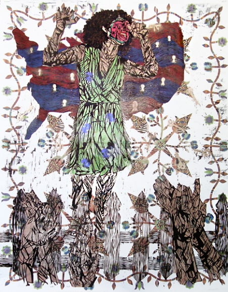 |
| Courtesy of JONATHAN FERRARA GALLERY, New Orleans |
I read all of the titles: Genetic Inferiority: Darwin's Theory of White
Superiority and Black Unintelligence, Congratulations You Made It!: Working
Your Way Up the American Caste System, The Jungle Bunny Gave You Fever. The Only Cure is to Fuck the Bunny. She Wants It., and
so on. Here is the problem I had
with these titles: what the titles stated in words got across more
powerfully in the work itself. The exclusion of the titles renders the work more broadly about race, gender and power, and maybe the artist wanted to be precise. I believe that any intelligent viewer would be able to deconstruct these images effectively and that any ambiguity would be an asset. Artwork, independent of written directive, allows the viewer to arrive at a unique kind of knowledge. Visual knowledge is
not subject to the limits of language; this is the great potential of visual art. In this show the titles were a kind of reiteration like a comedian explaining the joke, like—I learned this one recently—a hat wearing a hat. The work itself was much smarter than the titles, which were merely clever.
There are many ways that artists are currently expected to explain themselves and explain their work. Information is expected to accompany artwork. I think artists have internalized this precept and sometimes use the title line to give the work another little something, tell the viewer a little more, to over explain. Conversational titles (like "The Jungle Bunny Gave You...") can almost be categorized: wistful or cheeky. This is a trend I first remember noticing in the early 2000s. Once a trend is identifiable it ought to be reconsidered. Even writers have been instructed: show don't tell. Shouldn't artists be encouraged to do the same?
All that said, the work in this show was serious, ambitious, and well worth seeing. So Julia Street worked out pretty well. I live here now, in New Orleans; David Zwirner does not. I’m okay with that. Mostly.

No comments :
Post a Comment