Wednesday, November 25, 2015

Looking Good


In Memory, Photo Courtesy of the Artist

Rachel Jones Deris
Specters
Diboll Art Gallery, New Orleans


Our daily lives expose us to constant visual stimulus. Persistent and cursory engagement of our eyes seems to leave little room for more deliberate deployment of sight, which is to say, looking. Of the sight verbs–to see, to glance, to glimpse, to watch, and to look–looking seems to be the most directed, but it also implies an openness, a receptivity. It is the one most useful in engaging with art.

The first time I saw a painting by Rachel Jones Deris was in 2008. She is a confirmed painter who does not laurel-rest, who seeks new ground, and her work is continuously fresh. Compared to previous exhibitions, this group of paintings relies less on lyrical titles to buttress the content, and the content is harder to define. These paintings were surprisingly difficult to write about perhaps because they encouraged a suspension of thought, a resistance to conclusion. There are few or no conceptual footholds, save the title of the show and a couple of more expansive titles of paintings. The paintings lean toward abstraction but not closely enough to own that label nor are they descendants of notable abstract painters. They are representational but not in that irreverent I just found this image online-way. They are not geometric and they do not emphasize drawing. They are not political, narrative, or about anything you can easily put your finger on. I guess you could say they are landscapes in the sense that they (loosely) depict flora and in one case, fauna. All the things that these paintings are not lead us to what they are about.

In the end, I think this work is actually about looking. These paintings are a result of the artist looking, suspending her understanding of an image. I imagine that instead of looking at an image and concluding, I know what is there, she keeps asking what is there? What could be there? As a result we ask the same.

Rachel Jones Deris works from photographs, collected, altered, pared down. Paintings, any paintings, change and shift as you look at them, change from one viewing to the next. If a photograph freezes a moment, a painting lets it loose, leaves a moment eternally without conclusion. This is the mysterious potential of painting. These paintings, though they begin with a photographic image are not about photography or even image. If in an abstract way they are about looking, more practically they are about paint, lush, juicy paint. The designation “a painter’s painter” describes an artist who exhibits a confident and intuitive handling of paint while not subjugating this inherently unruly medium. Rachel Jones is a painter’s painter.

These paintings are made on Yupo mounted on panel. Yupo is synthetic paper, in layman’s terms it's plastic. Ad copy boasts its properties as stain-resistant and non-absorbent. You can see in these paintings how the paint sits on the surface of the Yupo, stains it to a degree, but doesn’t mingle with the ground. I confess I am a Yupo skeptic. While many painters work on a ground of acrylic gesso, which is also in part plastic, gesso contains calcium carbonate, or, chalk. This chalk is found in nature and brings to gesso a bit of nature’s unpredictability. I am not concerned about the archival integrity of the Yupo, its more of an aesthetic question: What would these paintings look like if they had been painted on gesso or even directly on panel?  On the other hand, Yupo resonates with the source material and process. The origins of these paintings are slick: a photograph, magazine page or inkjet print. It might make sense that the paintings begin on an equally sterile surface.

Stag, Photo Courtesy of the Artist
The paint seems to sit on the surface and the illusion of distance is built not by omission but addition. The artist piles on paint in spaces other artists would address with the sparest vocabulary. These are landscapes (all but one) but there is almost no deep space. Untitled (Grove) relies on an erasure to articulate trees. Meanwhile, the space between the trees is built up, a complicated articulation of color and directional marks bringing the distance past the foreground to the surface of our eyes. In Stag I find the inverted relationship cleaner cut and less convincing. The painting as a whole is way out there in its palette and spatial logic. But the popular and likeable shape of a stag, sits neatly center stage at a likable scale, keeping the painting from being too strange. The space may not have held its own without a form to anchor it, but the way that form was drawn, undermines the painting’s sense of freedom and confidence.

There were two paintings in the show that were like nothing I have seen. In Memory is a still life, a bouquet. A bouquet! Sill life is the wallflower (pun intended) of all the genres. Nonetheless I kept going back to this painting. My heart rate actually accelerated when I looked at it. It is gorgeous without being pretty. It is a still life, an inanimate object that seems to vibrate and sway. Many of the flowers are articulated in warm browns on white and when pink was used it was not as the color of the flowers but the shadows. The warm, saturated blues of the background press forward to tangle with floral greens, which do not seem to content to remain in the bouquet or even within the edges of the painting. And this bouquet is not anchored in a vase; the blue background continues across the bottom of the painting, the flowers pressing forward toward us.

I can compare looking at In Memory to looking at other paintings of flowers. But I can’t compare looking at Untitled (Weed) to any painting I have seen. On the left there is a dark passage cut by yellowish lines. On the right, the illusion of grass is confused by light blue hatching, almost a shape, dissected by lines of greens and browns. This illogical light blue has a satellite mark, a mark of the same blue resting strangely on top of an already strange passage of browns and yellows. To describe this painting is almost futile because the experience of looking at it is optically baffling, it makes vision feel like a physical activity. The palette, the composition, the articulation of the subject are completely original, the result of an artist who will bushwhack, who will step off the path and find her own way, who will treat each painting as a discovery. There is not a single uninteresting square inch in this painting.

It troubles me that so much of what I see in the world I have no choice about and also that I make the wrong choices about what to look at: advertisements, products, signage, screens, cars, junk mail, etc. A countermeasure to all that is to go look at paintings, especially paintings this stimulating, this good. These paintings require no discipline to look at them. They will seduce you into looking and when you eventually leave the gallery you will find yourself more attentive to leaves, and light and stones, and shadows, and spaces.

Please note: This show has been extended through December.

Untitled (Weed), Photo Courtesy of the Artist
Untitled (Grove), Photo Courtesy of the Artist 


Tuesday, November 17, 2015

Good People


James Taylor Bonds   Good Country People   48 x 48 in
James Taylor Bonds
Good Country People
Coup d’oeil, New Orleans

To Ken Capone, the director of Coup d’oeil (with whom I have had many conversations about art) I said, I don’t think I like these paintings...but I don’t think these paintings are trying to make me like them. For that I totally respect them.

The characters in these paintings are, well, off-putting. Some are pitiable, inspiring the urge to politely look away. Others are kind of scary. You want to look away but you don’t. These figures, often nude, sometimes clothed in sober neutrals do not look like good country people. In fact, even the country itself looks bereft of natural beauty. Take another route altogether if you can, but definitely don’t stop your car around here. 
  
James Taylor Bonds  The Felling   30 x 24 in
I don't know if any of these characters belong to Flannery O'Connor's short story Good Country People or even if the show is referring to this story, but they certainly share the author's sensibility and the looming air of malice in so many of her stories. 

Content aside,  most of these works are painted with a narrow palette. The couple that aren't seem like they might belong to an adjacent but different body of work. The breakdown of space is complicated, the figure/ground relationship somewhere between convincing and not convincing. The surface is reserved; only occasional brushmarks rise to a texture.

Believing a couple of the works were painted in oil, I thought maybe the artist used some low-quality oil paint. Then I learned that they were acrylic. This fact can account for flatness as well as the stiffer articulations of flesh and other textures. I have to admire what the artist accomplished in acrylic but I wonder if the attraction part of the attraction/repulsion response would be even stronger with optical complexity and luminosity of oil paint. And there are passages in the The Chosen (oil on canvas), in which the flesh gets really fleshy, not quite Lucian Freud fleshy, but fleshy.


This work is sort of haunted by art historical ghosts, though I find associations hard to pin down. The palette and composition sort of echo Thomas Hart Benton. The flavor of southern gothic reminded me of George Rodrigue’s pre-Blue Dog group portraits (which, in spite of myself, I find kind of interesting) Good Country People also reminded me of a Picasso painting. two actually, that I was recalling as one: Boy Leading a Horse and Family of Saltimbanques. Maybe it was the strangely posed figures, the rigid nudity, or the psychological heaviness. (By the way, I don’t really like Picasso’s paintings but you won't hear me argue that he was a genius.)

So while I cannot say I like these paintings this artist has my attention and respect. In the end I see something really important: the evidence of work, of hours and hours of labor and consideration, highly developed skills, and most significantly an artist pursuing his own strange vision on a scale that isn’t playing around.

One more point, not about the artwork but about the gallery, Coup d’oeil. On a local level, weird is okay but ugly is not. Not this kind of ugly. Not naked hillbilly ugly. In addition to acknowledging the artist’s chops and guts, I have to appreciate Ken Capone who owns a commercial (as in for-profit) gallery. He encourages artists to pursue their work as they feel compelled to even if (I imagine) profits might not follow. This work must be a hard sell for the kind of local art buyers who hang artwork in their dining rooms. One might not want to eat, sit, or sleep below a painting like The Chosen but Ken will show it anyway. And he deserves real props for that. 

(Some nice person should buy this painting and gift it to the Ogden.)

James Taylor Bonds   The Chosen   72 x 60 in


Wednesday, October 28, 2015

Wise Follies


Alex Podesta
Distractions and Follies: New Finished Works in Progress
The Front, New Orleans

Alex Podesta    Detail Untitled (Paddle)
There are five sculptures in Alex Podesta’s current exhibition at The Front. Artists showing large work in one of The Front’s four small galleries must overcrowd the art in order to exhibit a body of work or support the concept of an exhibition. This show is an example. On one hand, I would have liked more space surrounding each piece, but on the other, the curatorial balance would have been offset by omitting even one of these sculptures. The larger, more complex pieces especially needed more elbowroom. The Front, the collective with what is arguably the strongest exhibition program in town, could really use a big exhibition space. But about the work…

In Untitled (Bat/Boy/Bunny) A boy's head with rabbit ears was mounted on the wall leaning into the room, a blank stare on his face. The boy/bunny was half-sheltered beneath a transparent umbrella held by a man-sized right hand. Near the hand holding the umbrella, another man-sized right hand held a wooden baseball bat. The boy’s head was mounted at a height notably higher than the viewer's. Move in close and the bat looms above you, but you won’t quite feel threatened. You will be partly but not completely sheltered by the umbrella. I couldn’t figure out the ideal proximity or approach to view this piece although, as I said, the space does not allow for many options.
  
Man as a human-rabbit, or human dressed as a rabbit, is a trope of the artist. I have seen Alex Podesta's work before and never really questioned the function of the rabbit suits (or rabbit-humans) because it made sense in the weird world of the work. But in this case, with this piece, I find myself asking, wait, why does that boy have rabbit ears? Maybe its because they are not realistic (like the antlers in Untitled (All Hands), another work in the show) nor do they resemble a fluffy bunny suit, which comes comically loaded. Unlike the other elements of the piece (except the neck on which the head is mounted) these ears retain the look of having been fabricated. They also add a detail that may, along with the other props in the piece, be one too many. Without the rabbit ears the piece might be effectively creepy. The ears make it feel like a joke that doesn’t quite land or the topical effort to make a creepy proposition less creepy.

In the end I felt like I failed to experience what I was supposed to looking at Untitled (Bat/Boy/Bunny), failed to "get it." It’s not that I need to understand a work of art, but I want to be convinced by its weirdness. 

Untitled (All Hands) is another human-animal hybrid. The boy is part deer. Its  body was made of plywood that retained the pencil markings and holes that alluded to the process of its making. The boy/deer is captive, tethered by a sheer white ribbon held loosely by two (human) hands mounted on the wall nearby. I diligently noted all the details: the posture of the hands, both the boy/deer’s and the captor’s, the fact that the face of the boy/deer looks boyish but the hands belong to a man not a boy, that the ribbon is not a rope or chain. I noted detail upon detail but the sum did not quite cohere, nor was I overwhelmed by its absurdity. I never lost sight that I was in an art gallery. 

The three remaining sculptures were fantastic in their pared down weirdness. 

In Untitled (Pointer) a hand points to a map in an atlas on the floor. The hand is connected to a smooth rail of spruce tapering upward to join a finger, slightly bent, resting on the wall or pointing to it. Or if you follow the logic of the map below, it may be pointing to some place beyond the top of the mapped earth, to some place  far in the universe. The finger below points to the coast of Louisiana. I guess I can see one more thing here that points to here. If its this good that is.

In Untitled (The Resilience of Charles Ray), two fingers rest on the image of a red easel on the page of a charcoal stained catalogue or book. The gesture of the hand strikes me as specific and personal. Maybe it’s the hyper extended index finger. This gesture also recalls an inverted pose of the hand associated with icons of saints. The hand is connected smoothly at the wrist to a piece of pine lumber, I think it's a 2 x 4. As it rises from the hand the rounded wood regains its square dimensions and has burned to charcoal toward the top. One might accept this burning as a destructive gesture but I see the making of a giant charcoal drawing tool. I wonder if the easel in the photo illustration is a piece by the sculptor Charles Ray (who also used found materials and cast body parts in his work). In spite of the potential of this rather minimal work to be a one-liner I find it expansive, encompassing the idea of artistic heritage and raising questions with the mysterious directive represented by the fingers on the page.

A mahogany and spruce paddle leaned on the wall, blade up; in place of its handle is a hand. In Untitled (Paddle) the hand points with or rests two fingers on the floor. The paddle itself is a beautiful object, the light and dark wood alternating symmetrically so that a long dark stripe (reminding me of Barnett Newman!) runs down the center of the piece. Paddles are prehistoric objects laden with symbolic potential. (I saw a photograph of one from 6,200 BC!) This paddle gives way to a hand. If you took this paddle and held it as if  to propel a boat one of your hands would grasp the object at its center and the other would hold... its hand. Hand/handle. (How is this pun not corny!?) Finally, as the blade leans on the wall the hand is pointing with those two fingers to what? To the floor? To the earth? This piece is concise and funny, mysterious and weird and I really like it. 

The title of the show is Distractions and Follies: New Finished Works in Progress. The first part, Distractions and Follies could refer to the absurdity of making art, any art, let alone this art with its sense of humor. Finished Works in Progress is a funny bit of exhibition rhetoric, an artist's joke. I am going to consider the work finished and these are my conclusions: I don’t really connect with the larger works but I might have in a different space.  As I said, my first awareness in the gallery was of material. We intuitively register sculpture in our bodies. Its physicality relates to our physicality. The two more elaborate works in this show steer me away from this physical awareness to a more cerebral processing. This is art. What does this art mean? What do I think about it? But the the three wall-leaning works are witty without being weightless, funny and yet somehow authoritative, slapstick but omonous. They are nice to look at, the fabricated, altered and found components in perfect accord with each other. They do not feel like amputations or morphed humans-objects. They feel complete in their corpus and purpose. They feel wise in their absurdity.


Alex Podesta  Untitled (The Resilience of Charles Ray)

Alex Podesta   Untitled (Bat/Boy?Bunny)

Alex Podesta   Untitled (All Hands)


Wednesday, October 14, 2015

Review in Real Time


Bryce Speed
Ten Gallery, New Orleans

When I write about an artwork or exhibition, I usually summarize my cumulative experience of the work. Here though, I am transcribing notes I took in front of all eleven pieces in Bryce Speed's exhibition at Ten Gallery. So this review was, in a sense, written in real time. My notes are edited down for clarity and brevity but I hope they faithfully capture my viewing process and also honor the work with this record of careful looking. I spent about two hours looking at the work. These were my thoughts:

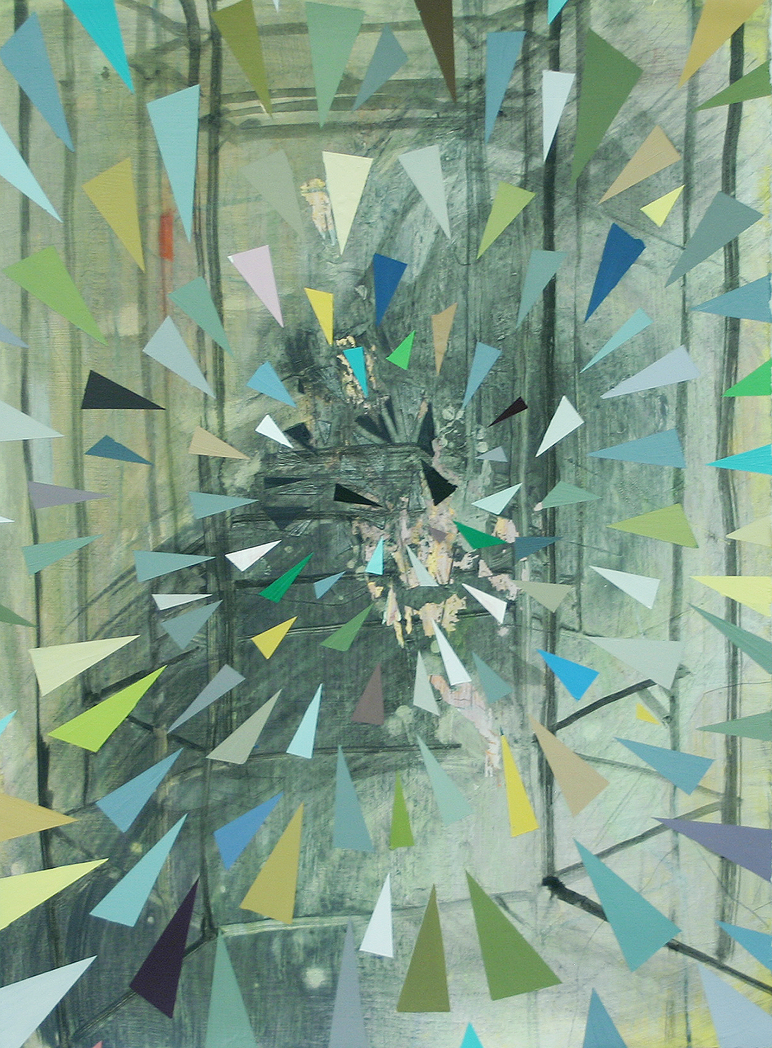
Yellow Portrait, watercolor and pencil on paper

I am suspicious of small, attractive, abstract or non-objective works on paper. Often, the appealing colors, shapes, and marks solicit a bland, hardly registered agreement: that's nice. Or they are seen as an object that would enhance a domestic space. I want to be bothered, to feel something new. I want art-especially small, attractive work–in some way to provoke or even annoy or bother me. Abstraction did not come to us without a revolution. But now this level of abstraction is pottery-barn ready, which can pose a challenge to the artist. An artist can use this language with urgency and vision but gesture of reducing a form or of recording a movement is not a new thought. This work is agreeable. But this is the first piece in the show so I have to keep looking at it and keep asking myself What is this artist doing? What is he looking for?

This piece is called “Yellow Portrait.” There is an illusion of depth within the four edges of this piece but I don’t know what kind of space that depth describes. It does not read as architecture (except maybe that arch), or nature; the marks look like brushstrokes, the pencil lines look like pencil lines. That white band reads as some kind of scrim, a curtain, or water, maybe. But really, the depth seems pictorial. The content seems to be the materials and even the title argues that this is a formal piece. I don’t dislike this piece it’s just a little too easy on the eyes for me.

I don't want art, even a small, non-objective works on paper, to be like the refined customers at a fine restaurant, chatting civilly and clinking silverware. I want the art to be like the unstable dishwasher yelling I quit! or something even crazier as he storms through the restaurant and out front door. Then when quiet returns to the room everyone is still a little shaken. Goofy example, I know. But even in a modest work of art I want to feel a shift in my mood or awareness.
Yellow Brick, acrylic, pencil, and oil on paper, 24" x 27"

Whoa. What are those things? I am looking at two triangleish forms that are coming off the surface of this piece by about half an inch. They seem to be constructed of thick, lemon yellow paint, modeled with a cake decorating tool. Now this is that weird, provocative thing I was missing in the last piece. One of these shapes (or, because they are so think they might be objects, forms) is leaving the frame of the page and invading the mat on which the drawing floats. Huh. Strange. I like it. 

The image behind forms is equally alluring and strange. A wash of bluish grey with white lines that make me think of water, or a curtain, and marks made by Julie Mehretu. I am already thinking “boathouse” when I focus in on the bunk bed-like structure whose mattresses are dressed in orange and yellow plaid sheets, the kind found in camp bunk beds in the 1970s or 80s…there are heavy, angled, brown lines that look like they bear the weight of the structure (and the drawing). Is this an A-frame? Again I am reminded of the 1980s and cottages. Then there is an outdoor space. There is green, there is water, there is a landscape. Pencil-drawn chairs recline in the web of perspective lines. I am hooked; I keep looking. I am in the spaces of this piece and then I realize I am no longer seeing the yellow forms interrupting the view until I see them. The piece is called "Yellow Brick." We, the viewer are outside the yellow brick. I think we are looking into the memory of a space.

The dishwasher is running through the restaurant.
Awash, ink, oil, and acrylic on paper, 17" x 21"

Coming from the last piece, I arrive at this one ready to see architecture and don’t those rectangles of grey frosting-paint look like bricks? Again, they place us outside looking in. Inside there is a fire and wallpaper suggested in pencil lines and  what are those dusty pink forms? In this space they look supernatural or as important as something supernatural; I do not read them simply as marks because I am following the logic of the picture. I am trusting the artist is not decorating the surface of a piece of paper. I see them as ghosts or the less superstitious cousin, memory. I feel like the artist is putting something back together, a place, a memory. There are those lines again (the ones I said resembled water, curtain, Mehretiu) and this picture is called "Awash." Yes, it looks like water is crossing the floor.
High Rise, acrylic, ink, and oil on canvas, 36" x 48"

Canvas is tricky, I think as I arrive at this painting. Canvas arrives with more baggage than paper. Canvas will deplete the surface of oil, of pigment even. Its texture can leave the eyes wanting more. But a canvas is shown (usually) without glass in front of it. It is not hard to feel the presence of the artist there working because as you stand face to face with a surface marked by his gestures, you stand in his place. This piece is more abstract than the previous two. Colored trapezoids look like rectangles floating in perspective. Doors without walls. There is an interior and an exterior, though these boarders are vague. The doors inside are the colors of wall paint, the ones outside are black and white. Behind them is a tidal wave of blue and grey. A wave, I say because this shape makes me think wave and because on its left, its breaking side, there are whitish circles that remind me of the stylized spray of Hokusai’s “The Great Wave.” What do I make of those reddish circles? What to I make of that green saber shape in the upper left? What do I make of this painting? I don’t know. It’s definitely not as comfortable as the works on paper. The artist does not have the upper hand here. The scale is bigger.The canvas is being difficult. I like that. Or maybe what I like most is that without the frame the painting is sort of suspended. I sense an ellipsis. When the artist’s activity is put in a frame, the ethereal content is concluded and contained.
Sixth Floor, oil and acrylic on canvas

This is an attractive painting. It also feels familiar. Again, the time I have spent with the previous works urges me to look for illusion of real space rather than read the space as strictly non-objective, pictorial. So I wonder how a viewer who does not make paintings him/herself sees paintings. Knowing the name of a color, the shape of the brush that made the stroke, understanding how a painting was made in the physical sense affects my interaction with it. With rapt pleasure I can watch a trapeze artist do what another acrobat might find elementary. Likewise, simple paint gymnastics don’t impress me. But when the familiar language of paint is deployed in the artist’s exploration of territory seemingly unfamiliar to him, I am engaged. This is the case here. Had I not seen the previous works I might not recognize the artist’s searching in this piece. It might have appeared decorative, almost quoting moments in the history of abstract painting. But at this point I trust the artist is following his own trajectory. (I wrote in a previous post about this moment, about the role trust plays in my art viewing.)

This is all to say that "Sixth Floor" might not interest me if I was approaching it without having seen the other work in the show. I would find it attractive but wonder if it had any depth. Now, in context, I see these black and white forms as architectural detail. There is a space behind it. This space seems unlit. Are we inside looking at twilight or are we outside looking a dark apartment building?
July Morning, oil and pencil on paper, 11" x 15"

I don’t know what to do with this one. I seem to be taking issue with the scale. Why? Let me ask another question: What is in this for me? As I said, for me, confident nice-looking marks don’t do it. I think I am taking issue with the travel-size scale. I am hung up on the scale. This seems like a little study or a notation but is it a finished work? The problem might be the frame, which elevates this piece, puts it on the level of the more finished, more ambitious works in the show. Now, I am delivered from the world of the artist into the practical world of the Art Show in which it may be wise to include smaller, more affordable options. (I didn't look at a price list; I have no idea how this piece is priced but here I am thinking about it.) But who knows, on another day this piece may seem essential.        
                                 
   
Spouting, acrylic, gouache and pencil on paper, 24" x 28"

Right away I like this piece. I mean really like it. I lean in. There is a lot going on spatially and on the surface. And there is what looks like a sort of ghost narrative. I say ghost because shapes representing objects are present to varying degrees of solidity. Also, there is the outline of a person and an outline of a head in profile. The space we look in on is a room in a modern house.

I think what I like about this artist’s work is that often a mark is simultaneously a mark and the articulation of an object or space. I am aware of both at once. The materials and gestures are one with the object or illusion they forms. Because the objects are realised to varying degrees, I seem to be witnessing the artist’s thoughts as they happen, as his marks conjure objects and spaces. This is the effect. And so this space seems reconstituted from memory with all memory’s peculiar generalization and detail.

Those blue marks in the far distance read as a building, like one of those glass office buildings you can see from far off in flat suburbs. How do I get that from what is essentially two or three drags of a paintbrush?

While some marks and color fields articulate an object or space, others suggest another layer I am thinking of as incidents. These are invisible things the artist has made visible. Wind. There is a passage similar to the ones I read as water or the notation of water in the pieces preceding this one but because of the way it is swirling and because the weight of the marks that define it, it might be wind instead. There is this outline of a head in profile; issuing from its open mouth are little isosceles triangles of solid black and white. These shapes, sit in a swarm on the surface of the illusion and also in it’s main space. They represent a different element, a different reality. Maybe speech. 

In this piece I see all of what I understand to be the artist's interests and abilities and I sense him following and grappling with his vision rather than directing it. 
Hexagon Place, acrylic and wax on paper, 15"x20"
Apartment Wave, acrylic and pencil on paper, 15"x20"


I found myself looking at the next two pieces together. Both contain a deep space of grey washes and vague line work. A more shallow space is made of triangles in one piece and trapezoids–reading as rectangles on various planes in space–in the other. I am often impatient with titles, usually when they take on a hazardous portion of an artwork’s total weight. In this case though, these titles informed the experience of looking at the work. Because these works are composed of abstract forms and marks, the titles encourage a reading that is not simply formal. “Hexagon Place” sounds almost like a street, a notation on a map, and it creates a bit of friction with the shapes pictured. 

I saw “Apartment Wave”–informed by the rest of the architecture in the show—as an apartment building before seeing the title. I found myself thinking of a Le Corbusier. Wave can refer to the pattern of windows or to an increase in construction in a certain area. The color of the shifting planes of rectangles recall paint swatches. As a grad student I sat in on a tenure review. The candidate was a painter and one reviewer commented that the palette of her small abstract paintings resembled the trendy colors in fashion that year. I have never forgotten the comment and have seen modes of color lifted from fashion or design make their way into art. In this case the association seems deliberate. The palette feels current, or retro in the current way. The association with interior paint supports what the piece seems to be about.
Night Deluge, ink, acrylic, and oil on paper, 22" x 30"
At first glance around the gallery I thought this was the piece I liked best. Or maybe it was the most unsettling. Now I am not sure. The artist seems to have been fighting the materials. The ink seems to have caused a problem for the artist. The forms seem unanchored in stark contrast to the other pieces. In a lot of ways this picture seems to be a hot mess. But I really, really appreciate artists willing to get themselves into trouble. The artist is in trouble here. There are really nice moments but there is a lack of cohesion. 

The title is “Night Deluge.” My process is to view the art work first, then the titles (and almost always stay away from the statement.) Before reading the title, though these elements are not explicitly illustrated in this piece I understood Night and saw water in the work. The title then for me is not only redundant but it names a thing I sensed which makes that thing smaller by naming it. The word deluge is also a bit like the word fancy; it undermines the thing it names.
Pods, acrylic and pencil on paper, 15" x 20"
Confession: I’m tired. Looking at the eleventh piece in this show my eyes feel saturated. So this might be a weak reading, not really fair to the work. What do I see here? This green, leaf-shaped thing is weird. I like its disruption. The structure resembles an apartment building. There are two empty little chairs facing each other. Since I am writing this in real time I think I am going to take a powder on this one. This piece is subtle. It is close to the door and the light switches which is never the place of honor in the room.
Later…
I looked at Bryce Speed's work online. And as I mentioned, I spent a lot of time with this show. I like his work and believe the artist is working thoughtfully and intuitively. I am trying to figure out why I want to see the scale pushed. Is it just a kind of auto-appreciation of the macho gesture? No I don’t think that’s it. Well maybe. But only insofar as that with the macho gesture an artist’s work becomes more ambitious. The artist fighting bigger dragons. 

I was thinking of two artists and how they relate to Bryce Speed: Julie Mehretu and Toba Khedoori (her large scale drawings from a while back). All three artists work with architecture and line and exhibit an almost totalitarian control of media. On a small scale this control can give an artwork the appearance of being too safe, too easy. I am not saying that Bryce Speed is not seeking challenges in is work, not at all. It just seems that he has chops he may not be using. 

It is possible that this has more to do with my own preoccupations than the artist’s trajectory; I worry that artists get lodged in certain practical circumstances such as a geographical norms, an academic setting, or the need to sell work to the most available buyers who might not be art collectors with space for large work. I find the strongest work in this show are the pieces that take on the task of describing a complicated space or the ones in which the materials (canvas, ink) present a challenge to the artist, which is to say the pieces that seem to be a record of artist pushing past the boundaries of what is known to him and taking the viewer to that precarious and exhilarating  edge.

Tuesday, October 6, 2015

What’s Trust Got to Do With It?


HonorĂ© Victorin Daumier, The Print Collector  Image Courtesy AIC
Today I saw a one-person show, mostly paintings on paper. I looked at the show piece by piece, spending about fifteen minutes in front of each work. I came to one that I might have passed over quickly if I hadn’t seen the others. It was more abstract than the others and maybe a little too neat to be stirring, a little too stiff for me to find an entry point. But the experience of the first four pieces had resulted in my developing a kind of trust in the artist and I applied myself to asking what the artist was going for in this piece. The other works had shown the artist wasn't merely making decoration. I trusted the artist’s process. This idea about trust arose in my mind and I thought: trust, that’s a funny idea. Does trust play a role when we look at art?

I trust work that looks like the artist needed to make it. I mistrust work that is too agreeable. I trust an artist whose work does not make me think of Art the way one trusts a writer whose writing does not make one think “I am reading.” I mistrust work that looks like it is a cog in a career, academic or commercial. I trust work that leaves me in a different state than it found me in. Usually, if I like an artist I trust that artist’s process. But sometimes I trust an artist whose work I don’t really like because they are working in a way I believe is motivated by a real faith in the potential of art.

In the case of the works on paper I mentioned above, I saw that the work was serious, that the artist was not working mechanically, was not making conservative or safe pictorial decisions. When I stood in front of a piece that was harder for me to appreciate, I kept looking. My trust in the artist’s vision urged me to keep looking. Then I realized I have written about this idea before though I have not used this word. When a gallery or organization or critic does something I believe is counter to the highest aim of art (which is, in my view is ideological and not commercial) it causes my trust in this gallery, organization, or critic to waver or not to form in the first place. Trust, the way I am thinking about it now, grows from an experience or series of experiences that show a commitment to these high ideals.

Why is trust in a gallery or institution desirable? For one thing it saves time. If I find a gallery’s program generally well-curated and the work is well-presented, I will take the time to visit it. Conversely, if I have found a gallery’s program unappealing, I avoid it. When a gallery's program is uneven I tend not to prioritize it. If a museum or gallery mounts a group show and the work is hardly low quality, the walls are crammed and the thesis is stupid, I may not revisit that museum for a while. This oscillating level of seriousness makes it hard to completely write off a venue but hard to fully trust the seriousness of its intentions.

An artist also places his/her trust in these institutions. Institutions create the context in which his/her work is encountered. If a gallery offers an artist a two-person show and it turns out that the other artist is the gallerist’s three year old, the artist’s work will suffer and the gallerist will obviously prove to be untrustworthy. I have seen very good artists end up, okay not exhibiting with a three year old, but exhibiting under conditions that I, an art viewer, have a hard time taking seriously.


I am accustomed to looking at art, to arriving at my own judgments. Why would I need to trust a critic's opinion when I can form my own? A couple of years ago I saw the art critic Holland Cotter speak at Tulane. He said this really smart thing and I've never forgotten it. I found the exact quote in his piece in the New York Times: 


"Taste is habit, a form of learned behavior. And habit is what we rely on to make us feel at home and comfortable in the world. So judgment based primarily on taste, like most art criticism, is inherently conservative, predictable, fixed."


I can trust the critic that came up with that. A good critic, one we trust, can take us from our habits to experience something new. Trust in a critic is like trust in a friend who urges you to try something he likes. I trust the critic Jerry Saltz. This is not to say that I like every artist and artwork that he likes. But when I read that he finds an artist worth considering I consider that artist and I am on alert not to have a knee-jerk reaction the work based on the limitations of my mood or taste.


Is trust essential to viewing art? Well, it helps. Think of a person in a situation of mistrust; he is skeptical, uptight, closed. A person who is among friends, allies, and people he trusts is relaxed. In order to experience art we must be receptive and open. Artists earn my trust by working toward their necessarily unique vision, by working toward what they do not yet fully understand, by taking risks and not accidentally adopting norms of scale, media, subject and so forth. Galleries, organizations, museums, and critics earn the trust of serious art viewers by consistently supporting that kind of artist.

I couldn't figure out how to end this post so I am going to send this ending in from left field. Last weekend was the annual "Art For Art's Sake." This phrase "art for art's sake" is one you beat to a pulp in art school. It signifies a concept (three hundred years old or so) that art can (and according to some ought to) exist for its own sake and not to illustrate or promote causes (political, theological, etc) external to itself. Then Walter Benjamin brings it up in his essay "Art in the Age of Mechanical Reproduction" and Voila! you find yourself in a grad school rabbit hole art debate wanting to wash your brain and get back to the studio. The use of the phrase for last weekend's event is ironic if not in its inception than in what it has become: pub crawl meets retail meets art openings. In my perfect world (which I realize would be a superbore to many) "Art For Art's Sake" would be a kind of sober lock-in with the work of one of my favorite artists–or even one of my don't-like-but-respect artists–and fellow lovers of art. Ladies and Gentlemen, Art! No food. No alcohol. No re-entry. There would not be 30,000 people in attendance like there was reported to be last weekend's "Art For Art's Sake" but I could trust that they were really there for art’s sake.


Peter Doig    House of Pictures    Image Courtesy Victoria Miro, London