Thursday, July 9, 2015

Will You Please Be Quiet, Please?*


Some galleries in New Orleans have music piped through their exhibition space or coming from a computer at the reception desk. I’ve asked, just to make sure, Is the music part of the work? No, it’s not.

Today I went to Julia Street.  There is a brochure put out called New Orleans Arts District. I circled every gallery that advertised itself as a contemporary gallery or one that shows contemporary work. There were eight. One, I discovered, does not show contemporary art (by contemporary they mean “of this moment”).  One gallery was closed. One had a sign Ring the bell for admission so I skipped it.  And one had a sign at the gallery entrance: Fine Arts Crafts and Picture Framing, which clarified its programming. So that left four galleries in which I expected to see contemporary art in a setting that adheres to basic customs of exhibiting contemporary art. Two of the four galleries were playing music.

Listening to music when trying to view paintings, photographs, or sculpture is no less irritating than listening to someone’s phone ringing in a movie theater. Wait–no, it’s like someone in the theater eating loudly, crinkling wrapers during the entire screening. The audio intrusion is distracting and it diminishes the impact of the film. In the case of music in art galleries, the gallery itself is the one crinkling the candy wrappers.

Art, real art, is complete in and of itself. My fundamental conviction is this: that art, above its role as a commodity, above its value as a thing to own, above the custom of decorating homes with it, offers an experience. That experience can be described as a kind of shift in our sense of where and what and who we are. I believe transcendent experience is what distinguishes true art from art retail. Is there anything wrong with art retail? It has its place. But what happens when a community collectively confuses (or abides by the confusion) of art retail with art that offers an experience?

I guess what I should ask on Julia Street is this: Is this a real art gallery? The description “contemporary” is too slippery so I say “real.” Is this gallery tapped into the larger context of the global discussion? Does this distinction matter? To serious artists, viewers, collectors (I imagine) it does.

The element I may not be adequately considering is the economic reality of the situation. Judging by the profusion of music in casinos and shopping mall stores, I’m sure some study shows that music promotes the spending of money. Maybe that is the thinking behind the decision to play music in an art gallery. Even if that is the case, knowing it will not make my experience different than it is. I guess I just want to know if I am supposed to take these galleries seriously. More broadly I am trying to determine if New Orleans is a viable place to be a viewer or maker of serious art (experiential, global, non-retail). 

Tonight I have written only about the Julia Street Galleries—and really 2 out of 4 of them, but hey, that’s 50%! But elsewhere in the city, including the more hip and with-it collectives, I have encountered not only music, but Saints Games and Netflix movies. Regardless of what motivates a gallery or gallery sitters to introduce music (or sound) to a gallery of work, it is not conducive to serious viewing. These days everything makes noise and noise is everywhere. Why would we not welcome the mysterious quiet of a painting? Why would we not allow a viewer to feel the memory of noise—power tools or chisel—emanating from a sculpture? And part of the power of a photograph is its stillness, the sounding world brought to silence.

My final questions are these: What kind of art experience do we have here in New Orleans and what kind of art experience to we want?


•

Post-Text Quote (In Defense of Music) by Milan Kundera, from the novel Ignorance:
“As early as 1930 Schoenberg wrote: "Radio is an enemy, a ruthless enemy marching irresistibly forward, and any resistance is hopeless"; it "force-feeds us music . . . regardless of whether we want to hear it, or whether we can grasp it," with the result that music becomes just noise, a noise among other noises. Radio was the tiny stream it all began with. Then came other technical means for reproducing, proliferating, amplifying sound, and the stream became an enormous river. If in the past people would listen to music out of love for music, nowadays it roars everywhere and all the time, "regardless whether we want to hear it," it roars from loudspeakers, in cars, in restaurants, in elevators, in the streets, in waiting rooms, in gyms, in the earpieces of Walkmans, music rewritten, reorchestrated, abridged, and stretched out, fragments of rock, of jazz, of opera, a flood of everything jumbled together so that we don't know who composed it (music become noise is anonymous), so that we can't tell beginning from end (music become noise has no form): sewage-water music in which music is dying.”

*Note: Of course I stole this title from Raymond Carver's excellent short story.

Wednesday, July 1, 2015

Artist Statement


Tonight I was having a conversation with the artist Jeff Rinehart. 

I was telling him that here in New Orleans I did not take for granted that all artists want the same thing. In my graduate school years and then in New York, it seemed that all the artists I knew wanted the same thing. Everyone wanted to climb the beanstalk that disappeared into the clouds, to find the castle of giants and the golden harp, to collect the goose and the golden eggs. The dream was to be represented by a top gallery, bought by important collectors, included in museums, not only to bankroll this artist's life but more importantly to be part of the culture, part of the conversation.

I gestured to a piece of Jeff’s work that hung on the gallery where we were having this conversation.

“I can ask you," I said. "Where do you want this to go? Where to you want this work to end up? In your dream scenario I mean…"

He answered, “The work is a dream.”

Jeffery Rinehart,  Damien Hirst in the attic,  C-Print on Fiber Paper, Image Courtesy of the Artist

Thursday, June 25, 2015

Viewer Discretion


Image Courtesy of John Powers

John Powers, Revenant
The Front, New Orleans


Opening Night
I went to the most recent Second Saturday Openings on Saint Claude Avenue. As any habitual art viewer knows, opening night is the worst time to see artwork, cramped by a crowd, drowning in noise. But it can be fun to exchange first impressions of the work and, practically speaking, there is the convenience of all of these weekend-only galleries being reliably open. The show that stood out to me that night was John Powers at The Front. There was one piece in particular that made an impression.

In addition to discussing the work of John Powers, this post is about the delicate task of being a decent viewer.

First Impressions
The centerpiece of John Power’s exhibition titled Revenant was a large, mechanical, electrically powered object that resembled a wheat field or reeds moving in the wind. It was parked on the floor, occupying most of the alcove of the small gallery. It made a hypnotic sound of moving wood and moving gears but it wasn’t noisy. It was captivating. This work deserves a bigger space, I thought. In fact it might even require a bigger space to really be seen as intended.

There was a silent video projection above the piece (I didn’t know whether it was part of the same work or its own piece). It showed a semi-abstract split screen mirror effect of clouds and statuary. Without pursuing the thought further, my impression was that it competed with the more engaging object below.

Second Viewings
I went back to The Front a week later. There were no other viewers in the gallery. The video above the mechanical reeds was not playing; an error message—Can’t Play The File—floated above the piece on the floor. I picked up the list of works and used Wikipedia to clarify some of the titles:

Revanant (the exhibition’s title):  “A revenant is a visible ghost or animated corpse that was believed to return from the grave to terrorize the living.”

Ialu (title of the mechanical piece): “Egyptologist Jan Assmann…suggested that Greek Elysion may have instead been derived from the Egyptian term ialu (older iaru), meaning "reeds," with specific reference to the "Reed fields" … a paradisiacal land of plenty where the dead hoped to spend eternity.”

The piece titled Ialu moved in a way that was both mechanical, generated by electricity and gears, and reminiscent of the natural world, a convincing rendition of wind in a field. The grass-like stems had vertical structures like horsetail reeds, a prehistoric plant still found on six continents The reeds moved in slow motion, or what would be slow motion in filmed footage of a reed field in the wind. This gave it a dream-like pace.

Sometimes a work of art will illustrate the strangeness of making art. Much time and skill was directed to making this curious object. From a pragmatic standpoint, making art is a waste of industry. It is also one of the best things humans do. The power of this piece was the contradiction of the industrial object and the evocation of natural beauty.

According to the title sheet the video was not part of Ialu but was listed as its own work,STLIII, a title I could not decode. Even if they were two distinct works, Ialu could only be seen from one side of its rectangular form. One could not look at the sculpture and ignore the video or in this case the error message that floated above it.

Wanting to confirm my opinion of the video from opening night, I went the artist’s Vimeo page. The 2 minutes 13 seconds video included clouds, a brief translucent face (unless I was hallucinating) and like goal posts to the afterlife, two statues of cemetery angels perched above crosses. The vocabulary of the show was steeped in the ancient worlds of Egypt and Greece, with Christianity as the latecomer. Other works in the show are titled Meta, Omphalos, and Dying to Rise from the Dead. The angels and crosses seemed kind of clumsy next to the more subtle allusions and creations. Although the video was not working that day, I stand by my first impression that it detracted from the piece it shared a space with. As a stand-alone video it didn’t really hold its own either.

The rest of the work in the show was much stronger. In a broad material vocabulary it explored the theme of the ancient and enduring lure of the afterworld, and managed to contain a bit of its fabricated mystery.

Research
My opening night impressions of John Power’s exhibition, specifically the piece Ialu, were an uncalculated response to the artwork in its environment. I was not familiar with the artist. I did not look for titles, read a statement or see a website. The second time I saw the work I looked at the titles, researched unfamiliar words, noted the materials used, and looked up the artist. This seemed to be a responsible thing to do if I was going to write about the work. My question now is this: does research erode or augment the experience of seeing? I am afraid that I cerebral-ized this work before I allowed myself to fully experience it. The setting—not quite spacious enough and having technical difficulties—did not help, but I overemphasized the need to decode the titles, think about the inclusion or omission of the video, and see other versions of the work. I spent almost as much time online as looking at the work in person. As a result I couldn’t relocate the intensity of my initial experience of the work. Mea culpa.

That said, on the artist’s website there is a version of Ialu that positions the mechanical reeds in front of a more simple video of clouds (also employing the split screen mirror effect, clouds folding into themselves). Although video is not noted with “wood, steel, plastic and electric motor,” the materials that comprise the piece, this particular video seems to transform the sculpture from a thing to a place. I would like to have seen this version.


Image Courtesy of John Powers

Saturday, June 6, 2015

TMI, Part 2


Katrina Andry
Jonathan Ferrara, New Orleans


I have not been to the Julia Street art galleries for a long time.  An accumulation of disappointing experiences kept me away. These experiences can be separated into two categories: those brought on by the work and those brought on by the galleries themselves. I felt disappointed as an artist and disappointed as a viewer. Things on Julia Street were just not what I was used to. The expectations I arrived with were formed in New York and New York is easy to feel homesick for even if it is not your place of birth, even if you (sometimes) remember well all its frustrations on many fronts including art. The thing about making and looking at art in New York is that is so, so serious. Also, it feels part of something global. When I moved here I couldn't even get a handle on the local use of the vocabulary I thought was universal in contemporary art. But after this many years in New Orleans (7 in August) I feel capable of separating expectations of habit and expectations that stand up to tests of time and rigorous reexamination. This is a part of that reexamination.

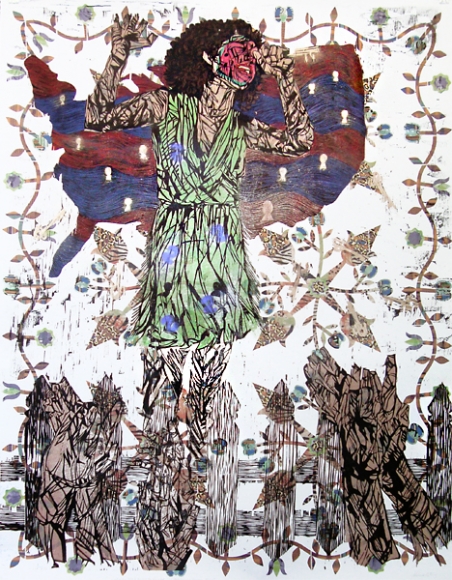
Today I went to Jonathan Ferrara. The front room (which is really the only room suitable for looking at large-scale works) was filled with large-scale woodcut reduction prints by Katrina Andry. The prints were dense with pattern, marks, color, and imagery. This visual texture was complex and engaging. The subject dealt with racial and gender politics but took time to decode. There was so much going on visually that they invited a long viewing with the layers of meaning slowly emerging from the work. Within the images there were quilt patterns (American, I would guess), and patterns of animal pelts (African, I think). There were also props: fruit, serpents, and some furniture featured in these tableaux. 

Courtesy of JONATHAN FERRARA GALLERY, New Orleans
My favorite piece depicts a woman singing, her hair curly, natural, a halo framing her face; her expression and posture are open and joyful. But imposed on her face is a watermelon slice, not easy to make out at first. In the far background is a quilt-like pattern, made up of flowers and spears, maybe. Behind the singer was an inverted map of the United States made of wavy bands of deep red and blue, dotted with white keyhole shapes that could also represent people. In the foregrown is a picket fence and in front of it (viewer -side) hands that appear to be clapping. This piece is loaded. I looked at it for a long time. Then I read the title, which was written at the bottom of the print: The Keys to the Gated Community and White Acceptance. Oh no, I said out loud.

I  read all of the titles: Genetic Inferiority: Darwin's Theory of White Superiority and Black Unintelligence, Congratulations You Made It!: Working Your Way Up the American Caste System, The Jungle Bunny Gave You Fever. The Only Cure is to Fuck the Bunny. She Wants It., and so on. Here is the problem I had with these titles: what the titles stated in words got across more powerfully in the work itself. The exclusion of the titles renders the work more broadly about race, gender and power, and maybe the artist wanted to be precise. I believe that any intelligent viewer would be able to deconstruct these images effectively and that any ambiguity would be an asset. Artwork, independent of written directive, allows the viewer to arrive at a unique kind of knowledge. Visual knowledge is not subject to the limits of language; this is the great potential of visual art. In this show the titles were a kind of reiteration like a comedian explaining the joke, like—I learned this one recently—a hat wearing a hat. The work itself was much smarter than the titles, which were merely clever. 

There are many ways that artists are currently expected to explain themselves and explain their work. Information is expected to accompany artwork. I think artists have internalized this precept and sometimes use the title line to give the work another little something, tell the viewer a little more, to over explain. Conversational titles (like "The Jungle Bunny Gave You...") can almost be categorized: wistful or cheeky. This is a trend I first remember noticing in the early 2000s. Once a trend is identifiable it ought to be reconsidered. Even writers have been instructed: show don't tell. Shouldn't artists be encouraged to do the same? 

All that said, the work in this show was serious, ambitious, and well worth seeing. So Julia Street worked out pretty well. I live here now, in New Orleans; David Zwirner does not. I’m okay with that. Mostly.


Wednesday, May 20, 2015

TMI or Not Enough Information?


David Politzer 
Ten Gallery, New Orleans 

                        
There was no supplemental material, no wall text, no list of titles, and no artist statement at David Politzer’s exhibition. I have been thinking about the way many artists communicate about their work instead of through their work. I saw David Politzer’s show without supplemental material but, disclaimer, I have known his work for many years. So when a member of the Ten Collective asked if I knew an artist to fill a gap in programming I called David who lives in Houston. While I was happy to walk into the gallery and find a density of serious art without the paperwork, a friend viewing the show with me sought out the supplemental information, wanting the artist’s direction in how to approach the work. So I began wondering when it comes to supplemental information at an art exhibition how much is TMI? What is the JRI (Just Right Information) when it comes to showing artwork?

Artists (with the exception of the highest echelon, I suppose) are currently in the habit of applying for shows, grants, residencies, and jobs that require them to re-articulate in words what they have already articulated with images or materials. This habit has positioned itself for many artists in front of the making (Horse, Cart). Enter the ever-present project. I should capitalize and italicize that: Project. A Project is a mode of working directed by a fore-statement. The problem is that often the work retains this heavy outline. Just color inside the lines, folks. And if the work manages to transcend its outline, artists often insist on redefining the outline in the artist statement. The collective habit of the artist statement may also be traced to uber-schooling and an emphasis on careerism. In graduate school we were told to know our elevator pitch. How cynical.

There are situations in which the artist statement makes it easier to represent, promote, sell, and buy artwork. Here in New Orleans, the dominant model for galleries showcasing contemporary art is the artist-run collective. This model puts artists themselves in the role traditionally left to the gallerist, curator, or dealer. Artist statements exist as the Cliff Notes to the work so viewers (or possibly art professionals who lack vision) can avoid the heavy and time-consuming task of looking at the art.

Upon entering the gallery viewers of David Politzer’s show were confronted not with a desk or podium of paperwork but a video projected on the wall. The rest of the wall space was occupied by photographs, mostly in pairs. Lurking around the photographs were small, unframed works on paper that combined text with graphic or photographic images. There were also ready-made (I assumed) vintage-looking Boy Scout merit badge handbooks about hiking, photography, and backpacking  on three occasional pedestals against the wall.

While there were no titles available to viewers, neither on a list or on the wall, I discovered that the photographs are titled on the artist’s website; these titles are mostly descriptive, noting subject, location, and date. The one that was different was Big Bend Lodge, Outside Looking In 2012. This title situated the viewer and knowing the perspective made the image more quickly readable. The titles also lead the viewer to believe (correctly) that these images are not digitally manipulated. All photographs but one in the exhibition were, the artist informed me, printed from negatives. A list of works may have informed the viewer wondering if the images were “straight” or manipulated. Some photographs of interior spaces included mural-scale photographic images of the outdoors, resulting in a strange but for me not unreadable space. I did not require titles or notes on media to facilitate my reading of this work but I look at a lot of artwork. I don’t think a list of titles would have been TMI, but in order to communicate titles and media a textual element would have been introduced to the viewing experience. The spell of images is fragile. I would vote to limit the reading to the text within the works on paper, which had a poetic minimalism.

I have chosen to talk about this show in terms of information because I found the artwork itself provided all the information I needed to have a meaningful experience. We viewers can only nurture our visual intelligence if we use it.

The video, titled From the Rim, was comprised of a sequence of amateur videos of people arriving at and posing in front of the Grand Canyon. My friend, the one who sought the artist’s statement, said that before speaking with the artist himself, she was under the impression that he had filmed all of the clips in the video. But no, she would have known after viewing the entire piece or viewing a few minutes attentively that these clips (there were almost one hundred) were the memorabilia of a cache of strangers (from YouTube actually). Her supposition had been reached very quickly. I am not picking on my friend; as a culture we have not emphasized the most indispensable tool to acquiring knowledge about art: looking.

What information would I like to see accompanying the artwork in a gallery exhibition? I would like to see very little. I would like to be trusted as a viewer. I do not think I am exaggerating when I say that an artist statement has never, ever made me like a show more or make the work seem better than I thought it was before I read it. (I read statements only after looking at the work.) When read in person with the work an artist statement is a little like a comedian telling a joke and then explaining how he thought of it and why it was funny. I appreciate knowing the titles of works but I raise an eyebrow when particularly heavy-handed titles accompany work that doesn’t live up to them. But more about titled in a future post. Finally, prices and red dots: they’re just facts but they nonetheless inject information into my experience and I am seeking a commercial experience. But whatever.

This was a good show. There was a lot to look at but there was a base note that unified and kept it from feeling excessive. The only thing I may have omitted were the Boy Scout handbooks. They steered toward kitsch and the show was more sincere than kitsch. The show seemed to be about looking for the mundane in the context of the extraordinary, looking for the banal on vacation. The video, full of people, informed the photographs, which were empty of participants, and vise versa. I imagined the works on paper as the slightly nervous inner thoughts of the one traveling through these vacation spaces of the American West. The text in all the pieces seemed to be in the same voice. There was a kind of quiet self-doubt in the voice, an urgent need to chart not only these wild spaces but the wild terrain of his response to them. If the photographs were the viewpoint of the speaker in the experience of leisure, the textual pieces were the interior monologue asking, Am I having fun yet? Do I belong here?

Of course this was just how I read the work. But I was perfectly content not to know exactly what the artist was thinking.