Wednesday, October 14, 2015

Review in Real Time


Bryce Speed
Ten Gallery, New Orleans

When I write about an artwork or exhibition, I usually summarize my cumulative experience of the work. Here though, I am transcribing notes I took in front of all eleven pieces in Bryce Speed's exhibition at Ten Gallery. So this review was, in a sense, written in real time. My notes are edited down for clarity and brevity but I hope they faithfully capture my viewing process and also honor the work with this record of careful looking. I spent about two hours looking at the work. These were my thoughts:

Yellow Portrait, watercolor and pencil on paper

I am suspicious of small, attractive, abstract or non-objective works on paper. Often, the appealing colors, shapes, and marks solicit a bland, hardly registered agreement: that's nice. Or they are seen as an object that would enhance a domestic space. I want to be bothered, to feel something new. I want art-especially small, attractive work–in some way to provoke or even annoy or bother me. Abstraction did not come to us without a revolution. But now this level of abstraction is pottery-barn ready, which can pose a challenge to the artist. An artist can use this language with urgency and vision but gesture of reducing a form or of recording a movement is not a new thought. This work is agreeable. But this is the first piece in the show so I have to keep looking at it and keep asking myself What is this artist doing? What is he looking for?

This piece is called “Yellow Portrait.” There is an illusion of depth within the four edges of this piece but I don’t know what kind of space that depth describes. It does not read as architecture (except maybe that arch), or nature; the marks look like brushstrokes, the pencil lines look like pencil lines. That white band reads as some kind of scrim, a curtain, or water, maybe. But really, the depth seems pictorial. The content seems to be the materials and even the title argues that this is a formal piece. I don’t dislike this piece it’s just a little too easy on the eyes for me.

I don't want art, even a small, non-objective works on paper, to be like the refined customers at a fine restaurant, chatting civilly and clinking silverware. I want the art to be like the unstable dishwasher yelling I quit! or something even crazier as he storms through the restaurant and out front door. Then when quiet returns to the room everyone is still a little shaken. Goofy example, I know. But even in a modest work of art I want to feel a shift in my mood or awareness.
•
Yellow Brick, acrylic, pencil, and oil on paper, 24" x 27"

Whoa. What are those things? I am looking at two triangleish forms that are coming off the surface of this piece by about half an inch. They seem to be constructed of thick, lemon yellow paint, modeled with a cake decorating tool. Now this is that weird, provocative thing I was missing in the last piece. One of these shapes (or, because they are so think they might be objects, forms) is leaving the frame of the page and invading the mat on which the drawing floats. Huh. Strange. I like it. 

The image behind forms is equally alluring and strange. A wash of bluish grey with white lines that make me think of water, or a curtain, and marks made by Julie Mehretu. I am already thinking “boathouse” when I focus in on the bunk bed-like structure whose mattresses are dressed in orange and yellow plaid sheets, the kind found in camp bunk beds in the 1970s or 80s…there are heavy, angled, brown lines that look like they bear the weight of the structure (and the drawing). Is this an A-frame? Again I am reminded of the 1980s and cottages. Then there is an outdoor space. There is green, there is water, there is a landscape. Pencil-drawn chairs recline in the web of perspective lines. I am hooked; I keep looking. I am in the spaces of this piece and then I realize I am no longer seeing the yellow forms interrupting the view until I see them. The piece is called "Yellow Brick." We, the viewer are outside the yellow brick. I think we are looking into the memory of a space.

The dishwasher is running through the restaurant.
•
Awash, ink, oil, and acrylic on paper, 17" x 21"

Coming from the last piece, I arrive at this one ready to see architecture and don’t those rectangles of grey frosting-paint look like bricks? Again, they place us outside looking in. Inside there is a fire and wallpaper suggested in pencil lines and  what are those dusty pink forms? In this space they look supernatural or as important as something supernatural; I do not read them simply as marks because I am following the logic of the picture. I am trusting the artist is not decorating the surface of a piece of paper. I see them as ghosts or the less superstitious cousin, memory. I feel like the artist is putting something back together, a place, a memory. There are those lines again (the ones I said resembled water, curtain, Mehretiu) and this picture is called "Awash." Yes, it looks like water is crossing the floor.
•
High Rise, acrylic, ink, and oil on canvas, 36" x 48"

Canvas is tricky, I think as I arrive at this painting. Canvas arrives with more baggage than paper. Canvas will deplete the surface of oil, of pigment even. Its texture can leave the eyes wanting more. But a canvas is shown (usually) without glass in front of it. It is not hard to feel the presence of the artist there working because as you stand face to face with a surface marked by his gestures, you stand in his place. This piece is more abstract than the previous two. Colored trapezoids look like rectangles floating in perspective. Doors without walls. There is an interior and an exterior, though these boarders are vague. The doors inside are the colors of wall paint, the ones outside are black and white. Behind them is a tidal wave of blue and grey. A wave, I say because this shape makes me think wave and because on its left, its breaking side, there are whitish circles that remind me of the stylized spray of Hokusai’s “The Great Wave.” What do I make of those reddish circles? What to I make of that green saber shape in the upper left? What do I make of this painting? I don’t know. It’s definitely not as comfortable as the works on paper. The artist does not have the upper hand here. The scale is bigger.The canvas is being difficult. I like that. Or maybe what I like most is that without the frame the painting is sort of suspended. I sense an ellipsis. When the artist’s activity is put in a frame, the ethereal content is concluded and contained.
•
Sixth Floor, oil and acrylic on canvas

This is an attractive painting. It also feels familiar. Again, the time I have spent with the previous works urges me to look for illusion of real space rather than read the space as strictly non-objective, pictorial. So I wonder how a viewer who does not make paintings him/herself sees paintings. Knowing the name of a color, the shape of the brush that made the stroke, understanding how a painting was made in the physical sense affects my interaction with it. With rapt pleasure I can watch a trapeze artist do what another acrobat might find elementary. Likewise, simple paint gymnastics don’t impress me. But when the familiar language of paint is deployed in the artist’s exploration of territory seemingly unfamiliar to him, I am engaged. This is the case here. Had I not seen the previous works I might not recognize the artist’s searching in this piece. It might have appeared decorative, almost quoting moments in the history of abstract painting. But at this point I trust the artist is following his own trajectory. (I wrote in a previous post about this moment, about the role trust plays in my art viewing.)

This is all to say that "Sixth Floor" might not interest me if I was approaching it without having seen the other work in the show. I would find it attractive but wonder if it had any depth. Now, in context, I see these black and white forms as architectural detail. There is a space behind it. This space seems unlit. Are we inside looking at twilight or are we outside looking a dark apartment building?
•
July Morning, oil and pencil on paper, 11" x 15"

I don’t know what to do with this one. I seem to be taking issue with the scale. Why? Let me ask another question: What is in this for me? As I said, for me, confident nice-looking marks don’t do it. I think I am taking issue with the travel-size scale. I am hung up on the scale. This seems like a little study or a notation but is it a finished work? The problem might be the frame, which elevates this piece, puts it on the level of the more finished, more ambitious works in the show. Now, I am delivered from the world of the artist into the practical world of the Art Show in which it may be wise to include smaller, more affordable options. (I didn't look at a price list; I have no idea how this piece is priced but here I am thinking about it.) But who knows, on another day this piece may seem essential.        
                                 
    •
Spouting, acrylic, gouache and pencil on paper, 24" x 28"

Right away I like this piece. I mean really like it. I lean in. There is a lot going on spatially and on the surface. And there is what looks like a sort of ghost narrative. I say ghost because shapes representing objects are present to varying degrees of solidity. Also, there is the outline of a person and an outline of a head in profile. The space we look in on is a room in a modern house.

I think what I like about this artist’s work is that often a mark is simultaneously a mark and the articulation of an object or space. I am aware of both at once. The materials and gestures are one with the object or illusion they forms. Because the objects are realised to varying degrees, I seem to be witnessing the artist’s thoughts as they happen, as his marks conjure objects and spaces. This is the effect. And so this space seems reconstituted from memory with all memory’s peculiar generalization and detail.

Those blue marks in the far distance read as a building, like one of those glass office buildings you can see from far off in flat suburbs. How do I get that from what is essentially two or three drags of a paintbrush?

While some marks and color fields articulate an object or space, others suggest another layer I am thinking of as incidents. These are invisible things the artist has made visible. Wind. There is a passage similar to the ones I read as water or the notation of water in the pieces preceding this one but because of the way it is swirling and because the weight of the marks that define it, it might be wind instead. There is this outline of a head in profile; issuing from its open mouth are little isosceles triangles of solid black and white. These shapes, sit in a swarm on the surface of the illusion and also in it’s main space. They represent a different element, a different reality. Maybe speech. 

In this piece I see all of what I understand to be the artist's interests and abilities and I sense him following and grappling with his vision rather than directing it. 
•
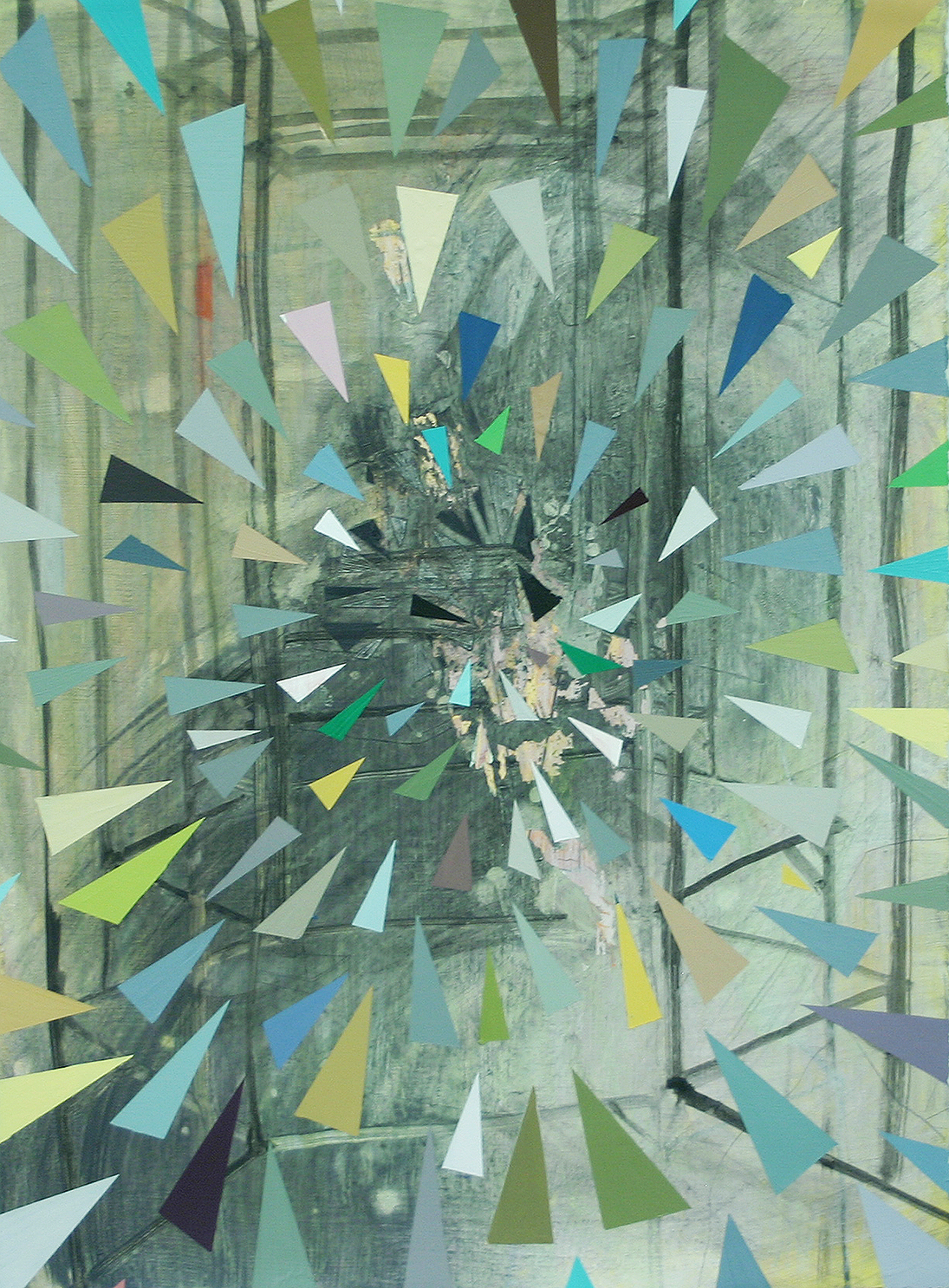
Hexagon Place, acrylic and wax on paper, 15"x20"
Apartment Wave, acrylic and pencil on paper, 15"x20"


I found myself looking at the next two pieces together. Both contain a deep space of grey washes and vague line work. A more shallow space is made of triangles in one piece and trapezoids–reading as rectangles on various planes in space–in the other. I am often impatient with titles, usually when they take on a hazardous portion of an artwork’s total weight. In this case though, these titles informed the experience of looking at the work. Because these works are composed of abstract forms and marks, the titles encourage a reading that is not simply formal. “Hexagon Place” sounds almost like a street, a notation on a map, and it creates a bit of friction with the shapes pictured. 

I saw “Apartment Wave”–informed by the rest of the architecture in the show—as an apartment building before seeing the title. I found myself thinking of a Le Corbusier. Wave can refer to the pattern of windows or to an increase in construction in a certain area. The color of the shifting planes of rectangles recall paint swatches. As a grad student I sat in on a tenure review. The candidate was a painter and one reviewer commented that the palette of her small abstract paintings resembled the trendy colors in fashion that year. I have never forgotten the comment and have seen modes of color lifted from fashion or design make their way into art. In this case the association seems deliberate. The palette feels current, or retro in the current way. The association with interior paint supports what the piece seems to be about.
•
Night Deluge, ink, acrylic, and oil on paper, 22" x 30"
At first glance around the gallery I thought this was the piece I liked best. Or maybe it was the most unsettling. Now I am not sure. The artist seems to have been fighting the materials. The ink seems to have caused a problem for the artist. The forms seem unanchored in stark contrast to the other pieces. In a lot of ways this picture seems to be a hot mess. But I really, really appreciate artists willing to get themselves into trouble. The artist is in trouble here. There are really nice moments but there is a lack of cohesion. 

The title is “Night Deluge.” My process is to view the art work first, then the titles (and almost always stay away from the statement.) Before reading the title, though these elements are not explicitly illustrated in this piece I understood Night and saw water in the work. The title then for me is not only redundant but it names a thing I sensed which makes that thing smaller by naming it. The word deluge is also a bit like the word fancy; it undermines the thing it names.
•
Pods, acrylic and pencil on paper, 15" x 20"
Confession: I’m tired. Looking at the eleventh piece in this show my eyes feel saturated. So this might be a weak reading, not really fair to the work. What do I see here? This green, leaf-shaped thing is weird. I like its disruption. The structure resembles an apartment building. There are two empty little chairs facing each other. Since I am writing this in real time I think I am going to take a powder on this one. This piece is subtle. It is close to the door and the light switches which is never the place of honor in the room.
•
Later…
I looked at Bryce Speed's work online. And as I mentioned, I spent a lot of time with this show. I like his work and believe the artist is working thoughtfully and intuitively. I am trying to figure out why I want to see the scale pushed. Is it just a kind of auto-appreciation of the macho gesture? No I don’t think that’s it. Well maybe. But only insofar as that with the macho gesture an artist’s work becomes more ambitious. The artist fighting bigger dragons. 

I was thinking of two artists and how they relate to Bryce Speed: Julie Mehretu and Toba Khedoori (her large scale drawings from a while back). All three artists work with architecture and line and exhibit an almost totalitarian control of media. On a small scale this control can give an artwork the appearance of being too safe, too easy. I am not saying that Bryce Speed is not seeking challenges in is work, not at all. It just seems that he has chops he may not be using. 

It is possible that this has more to do with my own preoccupations than the artist’s trajectory; I worry that artists get lodged in certain practical circumstances such as a geographical norms, an academic setting, or the need to sell work to the most available buyers who might not be art collectors with space for large work. I find the strongest work in this show are the pieces that take on the task of describing a complicated space or the ones in which the materials (canvas, ink) present a challenge to the artist, which is to say the pieces that seem to be a record of artist pushing past the boundaries of what is known to him and taking the viewer to that precarious and exhilarating  edge.

Tuesday, October 6, 2015

What’s Trust Got to Do With It?


Honoré Victorin Daumier, The Print Collector  Image Courtesy AIC
Today I saw a one-person show, mostly paintings on paper. I looked at the show piece by piece, spending about fifteen minutes in front of each work. I came to one that I might have passed over quickly if I hadn’t seen the others. It was more abstract than the others and maybe a little too neat to be stirring, a little too stiff for me to find an entry point. But the experience of the first four pieces had resulted in my developing a kind of trust in the artist and I applied myself to asking what the artist was going for in this piece. The other works had shown the artist wasn't merely making decoration. I trusted the artist’s process. This idea about trust arose in my mind and I thought: trust, that’s a funny idea. Does trust play a role when we look at art?

I trust work that looks like the artist needed to make it. I mistrust work that is too agreeable. I trust an artist whose work does not make me think of Art the way one trusts a writer whose writing does not make one think “I am reading.” I mistrust work that looks like it is a cog in a career, academic or commercial. I trust work that leaves me in a different state than it found me in. Usually, if I like an artist I trust that artist’s process. But sometimes I trust an artist whose work I don’t really like because they are working in a way I believe is motivated by a real faith in the potential of art.

In the case of the works on paper I mentioned above, I saw that the work was serious, that the artist was not working mechanically, was not making conservative or safe pictorial decisions. When I stood in front of a piece that was harder for me to appreciate, I kept looking. My trust in the artist’s vision urged me to keep looking. Then I realized I have written about this idea before though I have not used this word. When a gallery or organization or critic does something I believe is counter to the highest aim of art (which is, in my view is ideological and not commercial) it causes my trust in this gallery, organization, or critic to waver or not to form in the first place. Trust, the way I am thinking about it now, grows from an experience or series of experiences that show a commitment to these high ideals.

Why is trust in a gallery or institution desirable? For one thing it saves time. If I find a gallery’s program generally well-curated and the work is well-presented, I will take the time to visit it. Conversely, if I have found a gallery’s program unappealing, I avoid it. When a gallery's program is uneven I tend not to prioritize it. If a museum or gallery mounts a group show and the work is hardly low quality, the walls are crammed and the thesis is stupid, I may not revisit that museum for a while. This oscillating level of seriousness makes it hard to completely write off a venue but hard to fully trust the seriousness of its intentions.

An artist also places his/her trust in these institutions. Institutions create the context in which his/her work is encountered. If a gallery offers an artist a two-person show and it turns out that the other artist is the gallerist’s three year old, the artist’s work will suffer and the gallerist will obviously prove to be untrustworthy. I have seen very good artists end up, okay not exhibiting with a three year old, but exhibiting under conditions that I, an art viewer, have a hard time taking seriously.


I am accustomed to looking at art, to arriving at my own judgments. Why would I need to trust a critic's opinion when I can form my own? A couple of years ago I saw the art critic Holland Cotter speak at Tulane. He said this really smart thing and I've never forgotten it. I found the exact quote in his piece in the New York Times: 


"Taste is habit, a form of learned behavior. And habit is what we rely on to make us feel at home and comfortable in the world. So judgment based primarily on taste, like most art criticism, is inherently conservative, predictable, fixed."


I can trust the critic that came up with that. A good critic, one we trust, can take us from our habits to experience something new. Trust in a critic is like trust in a friend who urges you to try something he likes. I trust the critic Jerry Saltz. This is not to say that I like every artist and artwork that he likes. But when I read that he finds an artist worth considering I consider that artist and I am on alert not to have a knee-jerk reaction the work based on the limitations of my mood or taste.


Is trust essential to viewing art? Well, it helps. Think of a person in a situation of mistrust; he is skeptical, uptight, closed. A person who is among friends, allies, and people he trusts is relaxed. In order to experience art we must be receptive and open. Artists earn my trust by working toward their necessarily unique vision, by working toward what they do not yet fully understand, by taking risks and not accidentally adopting norms of scale, media, subject and so forth. Galleries, organizations, museums, and critics earn the trust of serious art viewers by consistently supporting that kind of artist.

I couldn't figure out how to end this post so I am going to send this ending in from left field. Last weekend was the annual "Art For Art's Sake." This phrase "art for art's sake" is one you beat to a pulp in art school. It signifies a concept (three hundred years old or so) that art can (and according to some ought to) exist for its own sake and not to illustrate or promote causes (political, theological, etc) external to itself. Then Walter Benjamin brings it up in his essay "Art in the Age of Mechanical Reproduction" and Voila! you find yourself in a grad school rabbit hole art debate wanting to wash your brain and get back to the studio. The use of the phrase for last weekend's event is ironic if not in its inception than in what it has become: pub crawl meets retail meets art openings. In my perfect world (which I realize would be a superbore to many) "Art For Art's Sake" would be a kind of sober lock-in with the work of one of my favorite artists–or even one of my don't-like-but-respect artists–and fellow lovers of art. Ladies and Gentlemen, Art! No food. No alcohol. No re-entry. There would not be 30,000 people in attendance like there was reported to be last weekend's "Art For Art's Sake" but I could trust that they were really there for art’s sake.


Peter Doig    House of Pictures    Image Courtesy Victoria Miro, London


Wednesday, September 16, 2015

Interview: Surface Tension


Untitled, Erica Lambertson
Erica Lambertson
Salon, New Orleans

This show is installed at Salon, an experimental contemporary art exhibition space created by the Founding Executive and Artistic Director of May gallery and residency. Salon is located 3446 Constance Street, Uptown, New Orleans. This exhibition will be on view by appointment through September 30. Call (504)316-3474 or email salon@keenekopper.com 

Detail from above untitled painting, Erica Lambertson
Surface.

It's interesting to remember that art used to be, necessarily, a face-to-face experience. Before the Internet, before Phaidon, we really had to stand in the same space with a work of art to claim we had seen it. These days seeing is often used interchangeably with being familiar with or having seen in reproductions. If someone asked me, Have you seen the paintings of Enrique Martinez Celaya? I might say, Not in person. or Yes, in a book. But somewhere in my mind I feel like I have had an experience with his work. This is not true. To experience a painting you must stand face-to-face with it.  You cannot take in the subtle languages of palette, scale, and surface in the pages of Artforum or even in a beautifully printed catalogue. And then there is the time we spend with paintings. When we watch a film or video we understand immediately that the medium is time-based. I like to remind myself (and anyone who will listen) that looking is also time-based. In other words, you need to spend time with a work of art. The surface of a painting will continue to transmit new information as long as you front of it.

So if you are still reading, its about to get nerdy(er). Below is an interview-slash-emailed conversation between the artist Erica Lambertson and I. It is all about reading the surface of paintings. If you want to stop reading and just look at the pictures, just be reminded that you should see these paintings in person.

Here it is.

Emily Farranto: I think of the surface of a painting as its entry point. Do you see it this way? How do you see the surface of a painting functioning in your work or if you prefer in the work of others?

Erica Lambertson: I would say that surface is one of the first things I respond to when I am in front of a painting. In my own work it's something I feel I'm always trying to improve on, or just give more thought to. In reality, when I'm actually painting, I don't think of the overall surface but I do think of individual paint strokes and will sometimes do something over and over again until the paint is sitting the right way. I like to paint on a very smooth surface so panel has been great for that... When I paint on canvas I never have the patience to sand it smooth enough so I often feel like I'm struggling against the surface, which I don't like. 

EF: Yes, canvas is not only a textured surface that slows down a brushstroke, it is a thirstier one. Depending on the ground, the canvas will absorb more oil than panel. So a brushstroke that looks both candid and complete on a panel will often appear drier and in want of more attention on canvas. So I'm wondering when you do work on canvas–these are mostly larger paintings, right? –is it for the scale? 

EL: I don't all together dislike the fact that canvas is dryer and more absorbent. It's not always a bad thing. I tend to paint over things several times and sand them down no matter what the surface is. On canvas this ends up having a slightly different feeling but I actually like that struggle. It’s rare that I am satisfied with my work on canvas but I have no desire to stop painting on canvas. When it "works" I'm really happy. I like to change it up: paper, canvas, panel. When I paint on canvas I try different kinds of surfaces: more rough, more smooth, rabbit skin glue, gesso, combination. So talking about surface gets weird I guess because it's different all the time…I am still experimenting all the time, still feeling totally insecure sometimes about whether something is working or not, but that is fun for me, it keeps it interesting, I'm not in a hurry to find the perfect combination. Sometimes it's nice to have that smooth, effortless feeling that panel brings but sometimes I'm feeling moodier and enjoy being frustrated by more annoying surfaces.

[This last one is one of my favorite comments. I like the idea of an artist welcoming frustration and annoyance.]

EF: You mention the struggle. I sometimes feel like a surface is where struggle or even insecurity and confidence co-exist. And the evidence of these remains. I think a good painting retains both. Does that make sense? Do you see this duality in the surfaces of your paintings or other people’s paintings?

Untitled, Erica Lambertson, Image courtesy of Keene Kopper
EL: That does make sense (about a good painting retaining both) yes, I know what you mean. I like that. It's kind of like watching someone think, or seeing the traces of their thought patterns, when you see that struggle in a painting. On my smaller, quicker paintings on panel or paper I'd say you can see most of what is going on. I don't sketch; I don't really do any under painting so to speak. One thing that does happen is that I'll often paint a new painting on top of an old painting. Some paintings might even have three different paintings layered together. I tend to leave anything from the old painting that might help the new one, either as under painting (color) or just leaving whole sections how they were, which can create some surreal (ish) narratives at times. This part of my process is probably what takes the most active thinking and planning. What stays and what gets buried.

EF: Looking at your smaller paintings on panel, there is a speed to them, It is a struggle to work on a larger scale in a way that retains the gesture while–I don't know how to put it–having the surface hold its own. All that without appearing overwrought. I guess what I am wondering then is what do you look for on the surface of larger paintings?

EL: I'm not like...aiming for a particular look, I just like to see what happens. It's rare that I like something so much I try to do it over and over again. It is the easiest thing for me to work large on canvas. It would not be possible to work large on panel because I would have a hard time storing them. And moving them. I guess I'd like to, but it just doesn't seem like something I can do right now. I love working large on paper but that gets damaged so easily! 

EF: I noticed you varnished some (or maybe all? of these paintings). What was your thinking behind that? How does that layer function?

EL: As far as the varnish goes I just started doing it recently and I just like the way it makes the paint look? It might just be a phase. I don't use a ton of medium and sometimes if paintings have uneven glossiness I like that varnish evens them out. 

EF: The surface is a kind of open record. Another painter or a seasoned viewer can tell a lot by reading the surface which records the layers of paint, the ground, the brushstrokes and erasures. Your paintings, especially the smaller ones, are very readable in these terms. What part of your process can’t I see on the surface of your paintings? 

EL: I don't know if I've told you this before but I tend to work on a lot of paintings at one time. Most individual pieces will take months to complete even though I only work on them a little at a time. A typical day in the studio involves working on about 5-10 different paintings. For about 45 min each. Occasionally I'll get caught up with one but I hop around a lot. Sometimes a painting will just be done very quickly and I'm trying to learn to respect that and not go back and keep layering. I think this has developed from working from photos and more and more finding that there is only a little bit from each photo that is usable. I will often use the same photo for several paintings; just different pieces show up in different places. Although my paintings are figurative and narrative I see all of my work as one large connected thing.

The following images are details of paintings by Erica Lambert on view at Salon.


Thursday, September 10, 2015

Butterfly Effect

On September 2nd Cameron Shaw posted an Editor's Letter on the Pelican Bomb website. It is titled Making Room and addresses the mural by Kelsey Montague, which I wrote about in a recent post. In this letter she contextualizes the mural within a series on "power and public space in the digital age." 

I like things in a series because in the space between one thing and another a real dialogue can occur. Even if B doesn't interest you, C might. And between B and C are similarities and differences to explore. 

This letter was interesting to read because even though it was not addressed to me, it addressed my questions about Pelican Bomb and articulated motivations I may not relate to but nonetheless respect. Any form of one-way internet opinion-voicing risks seeming like trash-talking, so I was glad to read what seemed to me like a thoughtful response. Then we have a dialogue. Which is good!

Wednesday, September 9, 2015

What I Like About (This) Painting


John Isiah Walton  (Center Panel) Brown Beat - Bounce Triptych
John Isiah Walton
The Front, New Orleans

I am sorry to say that this triptych, titled Brown Beat – Bounce Triptych is no longer on View at the Front. What do I like about this painting? This is what I was asking myself when I was standing there liking it. And then I would get distracted from the task of articulating what I liked about it by looking at the painting. I came to the conclusion that this is what I liked about it. Painting makes me forget about thinking.

Let me try again here. I liked the speed and confidence in the brushstrokes. When brushstrokes are visible to this degree and at this scale a painting takes on some of the artist’s physicality. In this case, because the painting holds it, the subject holds it. So these images of people are infused with this physicality, this life. I’m not being mystical here. This is just a barely conscious sense that comes from simultaneously looking at an image of a person and seeing the labors of a person. There is another correlation between the painting and the subject. When paint dries (from the outside in) we refer to the outside as skin. Paint as skin. In these portraits the skin colors are also the background colors (and recalled in the title). 

I spent most of my time looking at the middle panel of the triptych. There was so much information in this portrait despite the fact that the language was minimal. It is a mysterious thing to be regarded by a painting. Come to think of it, paintings have taken on some of the nonchalance we have taken on toward them. Let me think about that a second to figure out if it is true. I’m thinking there are not many paintings around that really look at us. This one does for sure. But just the middle panel. On the left a woman laughs. She makes a hazy eye contact but her attention is elsewhere. On the right is a figure who is only interested in being looked at (his expression, his hair, his glasses tell us this). The contrast of these three different engagements is really interesting to experience.

What is this triptych about? The title refers to a type of music, a culture I know little of. But the paintings hold up without background knowledge. They don’t rely on a concept. In this way they are open. Which is part of the power of paintings. 

I was just rereading an interview between Chris Ofili and Peter Doig that was published in BOMB magazine in 2007. This is one of the best conversations about painting I have ever almost witnessed. And they talk about foreknowledge and the openness of paintings.

Chris Ofili says: “There’s nothing like walking into someone’s studio and seeing a painting for the first time. You get that rush of information coming at you, unmediated. The less you know beforehand, the purer the read.”

Peter Doig responds: “Yesterday I was talking about the way people look at paintings in public spaces or even in studios, which is very different from the way they look at just about anything else. It’s a kind of lost but scrutinizing gaze, focusing on a painting. It’s not fixed, like a still photograph is.”

I was recently thinking about how paintings are experiences before they are objects. This is true for the artist and in some cases for the viewer. As the viewer, this was one of those occasions for me. 

John Isiah Walton    Brown Beat - Bounce Triptych     The Front


Friday, September 4, 2015

Rhetoric and Water


Ten Years Gone
NOMA, New Orleans

Please note: This exhibition closes in a few days. All articles mentioned were written months ago. The piece quoted last was written years ago. I'm just saying, the only thing current is my reaction. 


Dawn DeDeaux from the series Water Markers at NOMA
Part 1 - Rhetoric
The other day I saw the exhibition "Ten Years Gone" , curated by Russell Lord at The New Orleans Museum of Art. Later that afternoon I read Thomas Beller’s Don’t Call it Katrina on The New Yorker website. The article is a roving  exploration of the semantics related to Hurricane Katrina and the ensuing flood of New Orleans. Both curator and writer moved to New Orleans from New York City after the storm. As did I. Beller’s essay begins: “The tenth anniversary of Hurricane Katrina looms here in New Orleans, an event for which I had every intention of lowering my head and keeping quiet.” I can relate to the author’s instinct to “keep his head down” and I intend to remain mum on the subject of Katrina (both the storm and man-made disasters that followed) except for how it relates to the exhibition "Ten Years Gone" . Beller explored the rhetoric of Katrina; I want to praise the power of quiet things. 

"Ten Years Gone"  was a quiet show. Even the show’s one video was silent. That quiet felt significant amidst all of the talk surrounding the anniversary of Katrina. Art can side-step rhetoric. That’s what I was thinking while I was making notes about the work in the show, Beller’s essay still reverberating in my head. Then, I came across a preview of "Ten Years Gone" published by Doug MacCash on May 27, 2015 in the Times Picayune. Art can side-step the rhetoric until someone drops a crate of rhetoric on it. Which I guess I am adding to.

MacCash wrote, “Based on my brief preview, the show may be emotionally accurate in abstract terms, but it felt too orderly, dry and off target…Don't expect gritty aerial flood photos, passionate paintings of ruined houses, or splintery sculpture made of storm debris. "Ten Years Gone," is not a recollection of the destruction, violence, politics and confusion of late summer 2005." Beyond description, MacCash does not have much to say about the artwork in "Ten Years Gone"  except to say what it is not (flood photos, paintings of ruined houses, sculpture made of storm debris).

I have a few questions about his reaction. Why was his visit to the exhibition “brief”? What does that mean, the show was “too-orderly?” And dry? I would be interested in hearing these criticisms fleshed out. I wonder about the “target” MacCash refers to but I suspect that subject pulls away from art (which I can speak about) and toward the politics of belonging (which is a quagmire I am trying not to step into) Anyway, the issue was addressed in a piece that Cameron Shaw wrote for the New York Times. She quotes MacCash’s calling the show “off-target.” He publishes a response of sorts titled New York Times art review asks “Who has the right to speak for New Orleans?” which MacCash then answers with a quote parsed from Shaw’s own article.

MacCash writes, “the show may be emotionally accurate in abstract terms, but…” This is closest he comes to a favorable comment on show but I don’t really understand it. What is “emotional accuracy”? Can an art exhibition ever be factually accurate? Historically accurate? What would that look like? And what are those “abstract terms”? I would guess that those abstract terms are the nebulous components that make up art. He uses language of precision again, this time regarding not a target but emotions. I think emotional accuracy, if it exists, sounds like an accomplishment.

But a place cannot have an emotional experience. The people in a place have emotional experiences and they are all different. When we try to unify those, to make them homogenous, we enter the territory of rhetoric. There is a notion one encounters in New Orleans: you must love this city this way. And if you don't you don't quite fit in. The thing is, I have heard those born and raised here and generations legit tell me that this is a recent frustration. People are telling each other how to love New Orleans or for that matter how to grieve for its losses or hope for its future. It’s absurd to believe in emotional homogeneity and therefore emotional accuracy.

I have observed in written and verbal discussion of local art that a given work or show is not New Orleans-y enough or it gets New Orleans all wrong. That "Ten Years Gone"  and other exhibitions marking the anniversary of 2005 will attract this criticism was inevitable.

There is one more thing about Doug MacCash’s review that is pretty unusual. Artists seem to be listed in descending order of their local-ness and to what extent their work literally addresses Katrina. Here is what I mean:

MacCash refers to the first two artists as “New Orleans artist Dawn DeDeaux” and “New Orleans artist Willie Birch.” He writes, “Dawn DeDeaux's "Water Markers," are the most explicit references to the 2005 flood.” Of Birch he writes, "...bronze crawfish tunnel castings and drawings of wildflowers imply the power of a natural disaster to displace species. Crawfish and certain flowers only arrived in his yard after the 2005 flood.” 

Third, Isabelle Hayeur is not from New Orleans but, MacCash notes that she spent time here “during a post-K artist residency” Some, but not all of her photographs were taken in Louisiana. 

Next, MacCash describes Christopher Saucedo as a “One-time New Orleans resident” and goes on to say “Saucedo’s Gentilly home was ruined by the 2005 flood, and he produced several compelling artworks that addressed the levee failures. Yet his ethereal cast-paper collages included in "Ten Years Gone" depict the World Trade Center. “ He doesn’t say it outright but I get the idea that he not interested in exploring a connection. His tone reminds me of that old salsa commercial: This stuff’s made in NEW YORK CITY!

The last two artists, Spring Hurlbut and Nicholas Nixon, are not given any geographical distinction. After descriptions of their work the reviewer concludes “The video has no direct relationship with Katrina or the 2005 flood,” and “Also, no direct relation to Katrina.”

Apparently we are not curious to know where the non-New Orleans artists are from, or where the artists who spent time in New Orleans now live. I can appreciate that MacCash advocates for local artists, at least in this case. But the question is, is it the job of museums to show local work or show work to locals? I vote for the latter. We see the work of local artists in the local galleries. Artists show more frequently here then anywhere I’m familiar with. Most importantly, local artists need to experience artwork from places more distant than Julia Street or Saint Claude Avenue. I also appreciate that Doug MacCash advocates for locally relevant content, especially in this case, but I wonder what conscientiously chosen content is not relevant to local viewers, many of whom are tired of or even bothered by “passionate paintings of ruined houses.”

MacCash had a problem with the show because it wasn’t about New Orleans. I had a problem with his art review because it wasn’t about art.

MacCash was evidently not pleased by the gap between the realities of 2005 and the work in the exhibition "Ten Years Gone". I am sure some viewers responded similarly. In a way, these anniversary exhibitions are a set-up. Charged with the task of commemoration, an art curator (one who moved here since the storm, no less) must contend with what is not a collective experience but hundreds of experiences and do so with museum-quality art. What some people are looking for in these anniversary exhibitions might better be found in a history museum. If art possesses the ability to wash the rhetoric, the art curator must take a courageous step away from illustration, which will merely reinforce it.

Part 2 - Water
Now here are some of my own thoughts about the artwork.

I liked the choice to show the photographs of Isabelle Hayeur in the atrium space. I liked the unifying element of the waterline. This body of photographs introduced the language of water levels, cities, and the almost invisible world beneath the surface of our waterways. These photographs remind us that our human activities affect the water. This work was good looking, and with its good looks it ushered the conversation of the environment into the room.

Willie Birch’s work is the most textured and tactile-looking work in the show. According to the show notes and wall text his sculptures of crawfish holes are said to be “symbols of displacement” while the drawings of wild flowers “represent resilience.” Without the accompanying text I would not have associated them directly with Katrina. Already familiar with Birch’s large, muscular drawings of houses and streets (one of which was present), I liked seeing these intimate observations of nature.

Intrinsic to the language of photography is the language of time. The photographs of Nicholas Nixon take one moment and pull it through a span of forty years and there we see relative youth become relative age. The experience reminds us that our own faces, our own sisters are also moving through time. Now, the question must be asked: What are these doing in this show? If some viewers were frustrated by the inclusion of this artists work I was interested in it. I liked asking myself how they fit in.  I think they are about the passage of time, forty years to be specific. We are reminded that while ten years have passed since 2005; thirty years will also pass. And in a show full of buildings, water, and earth; these photographs lend us humans, they lend us family. expand the scope of the show without diluting it.

Before the Twin Towers were no longer there I worked on Warren Street in Lower Manhattan and would often use WTC subway stop. Atypical to many New York transplants I didn’t make an effort to become the person a tourist could ask for directions. Until they were no longer there I would look for the towers when I surfaced at an unfamiliar subway stop so I would know which way was south and be oriented. Christopher Saucedo’s works on paper made a cloud-weight lightness an unbearably heavy thing: a building, a terror attack, all those deaths including the death of a brother. That tension rested in the work. For me the perspective of these images recalled the physical act of looking up at the towers. I may not be the best person to say how these works hold up for those without a physical memory of them, but in the context of this show they seem to suggest that as humans we share our tragedies in spite of the eggshell territory we walk on to make comparisons. (Again, see Beller’s essay.)

Of the work in the show I was the least responsive to Spring Hurlbut’s video titled Airborn. I made the mistake of looking at the wall text before watching the video and this I think tainted my experience. The smoke drifting upward on a black background resembled chemical vapor more than something from a funeral pyre, which is, I read, what it was. The presence of the artist in the video ought to have humanized the piece but the figure’s face was covered and her movements were not naturalistic. The work was viewed on a flat screen at ordinary viewing height so scale or placement did not become part of the experience. This was also the only artist in the show who was represented by a single piece.

The first work I ever saw by Dawn DeDeaux was from her StePs HomME series, which was made in response to the events of 2005. These were public sculptures in the shape of steps that resembled stoops bereft of the house they once lead to. With minimal language these sculptures spoke of loss and even hope (they were lighted). They offered solidarity with those gone both from the city and from the earth. The series represented in Ten Years Gone titled Water Markers was equally minimal, and also used the physical and local vocabulary of the Flood. Tall, slender slabs of polished acrylic contained the translucent image of water and, near its top the water’s surface. Stains made by high floodwater could still be seen around New Orleans when I arrived in 2008,. Most been painted over or razed. These objects remember them. They are to scale and as you stand beside them the experience is physical. There is a terror in these beautiful objects. Like the steps, I don’t know how these works will translate outside of New Orleans or with the distance of time but this immediacy is part of what I like about them.

One Water Markers sculpture was situated among the landscape paintings specifically between two seascapes. This may have been my favorite moment of the show. I imagined all of those old paintings under water. 

I like the breadth of the show and that the artists (with the exception of Spring Hurlbut) were represented by more than a single work. The show managed to be conceptual without being opaque. If you looked with patience and asked questions of the work and of the show itself, concepts emerged, concepts of mortality, time, and the elements intermingling as they do here in New Orleans and everywhere else for the span of the human lifetime and subsequent lifetimes. Through a minimal palette and rhythm (the majority of work occurred in like-sized works, displayed in regular or semi-regular intervals) a tone was established. That tone was a little mournful and a little hopeful. Not a bad tone for a ten-year anniversary show.

In his essay Beller relates a conversation with NPR’s Eve Troeh who he quotes as saying “In the media, after Katrina, there was a lot of sympathy, not a lot of empathy.” They compared the reactions to 9/11 and Katrina. I don’t objectively recall the reactions in the media to 9/11 the way a news professional would but I remember my students in a rural college in Upstate New York. The majority of these students had never been to New York City. They had little understanding of the magnitude, of the physical scale of that event. I would say they also  has less empathy than my students at a nearby University, many of whom lived in or outside of New York. My point is that empathy is encouraged by parallel physical experiences.

When you stand next to DeDeaux’s Water Markers you feel the height of the water compared to your body and are physically moved to empathize with those who saw the water rise in New Orleans. When you look at Saucedo’s floating tower-clouds, you feel a weight, the weight of your body, the weight of all the ugly, human-perpetrated disasters that haunt the timeline of history, not just in 2001 or 2005. Crimes of inaction occurred in 2005 and are also occurring right now. We must remain moveable. If art can help move us to greater empathy, if we can not just read or listen to events but feel them, art is worth the space it takes up. A painting of a ruined house would have done noting to move me and I don’t think it would have honored the victims of Katrina as meaningfully the work in the show did.

One final thought: "Ten Years Gone" is a Led Zeppelin song. The Song engaged in repeat-play in my head every time I read or wrote its title. Was this intentional? I mean the lyrics don't not fit, but I felt as they were running through my head that this was the wrong direction...I cannot expect that everyone listened to Physical Graffiti as much as I did in high school but there you go; in my world that phrase has been retired. Zeppelin aside, the title alludes to the events of 2005 but does not name them. The show was more open than its title, which scarcely contained it. A title even less specific to Katrina may not have fit either and would have required another act of courage judging from the MacCash review. Then again, does Doug MacCash represent a majority of people New Orleans? I came across the term K-10 when a friend (born and raised local) told me she hated it. Rhetoric, like water, must move to stay potable.

Which reminds me. I just read David Forster Wallace’s commencement speech This Is Water for the first time. He opens with a story: "There are these two young fish swimming along, and they happen to meet an older fish swimming the other way, who nods at them and says, 'Morning, boys, how's the water?' And the two young fish swim on for a bit, and then eventually one of them looks over at the other and goes, 'What the hell is water?" He goes on to say, "The immediate point of the fish story is that the most obvious, ubiquitous, important realities are often the ones that are the hardest to see and talk about." The speech concludes, “It is unimaginably hard to do this, to stay conscious and alive, day in and day out.” 

Art helps us stay conscious. It not only refreshes the rhetoric, it washes our eyes when they have become gritty with cliché or politicized images. This is why art necessarily cannot do what you expect of it, why it cannot become mere illustration.

If you haven’t read that commencement speech you should. This is Water. It could have worked as an exhibition title too.

Christopher Saucedo  Installation View  New Orleans Museum of Art