Wednesday, September 9, 2015

What I Like About (This) Painting


John Isiah Walton  (Center Panel) Brown Beat - Bounce Triptych
John Isiah Walton
The Front, New Orleans

I am sorry to say that this triptych, titled Brown Beat – Bounce Triptych is no longer on View at the Front. What do I like about this painting? This is what I was asking myself when I was standing there liking it. And then I would get distracted from the task of articulating what I liked about it by looking at the painting. I came to the conclusion that this is what I liked about it. Painting makes me forget about thinking.

Let me try again here. I liked the speed and confidence in the brushstrokes. When brushstrokes are visible to this degree and at this scale a painting takes on some of the artist’s physicality. In this case, because the painting holds it, the subject holds it. So these images of people are infused with this physicality, this life. I’m not being mystical here. This is just a barely conscious sense that comes from simultaneously looking at an image of a person and seeing the labors of a person. There is another correlation between the painting and the subject. When paint dries (from the outside in) we refer to the outside as skin. Paint as skin. In these portraits the skin colors are also the background colors (and recalled in the title). 

I spent most of my time looking at the middle panel of the triptych. There was so much information in this portrait despite the fact that the language was minimal. It is a mysterious thing to be regarded by a painting. Come to think of it, paintings have taken on some of the nonchalance we have taken on toward them. Let me think about that a second to figure out if it is true. I’m thinking there are not many paintings around that really look at us. This one does for sure. But just the middle panel. On the left a woman laughs. She makes a hazy eye contact but her attention is elsewhere. On the right is a figure who is only interested in being looked at (his expression, his hair, his glasses tell us this). The contrast of these three different engagements is really interesting to experience.

What is this triptych about? The title refers to a type of music, a culture I know little of. But the paintings hold up without background knowledge. They don’t rely on a concept. In this way they are open. Which is part of the power of paintings. 

I was just rereading an interview between Chris Ofili and Peter Doig that was published in BOMB magazine in 2007. This is one of the best conversations about painting I have ever almost witnessed. And they talk about foreknowledge and the openness of paintings.

Chris Ofili says: “There’s nothing like walking into someone’s studio and seeing a painting for the first time. You get that rush of information coming at you, unmediated. The less you know beforehand, the purer the read.”

Peter Doig responds: “Yesterday I was talking about the way people look at paintings in public spaces or even in studios, which is very different from the way they look at just about anything else. It’s a kind of lost but scrutinizing gaze, focusing on a painting. It’s not fixed, like a still photograph is.”

I was recently thinking about how paintings are experiences before they are objects. This is true for the artist and in some cases for the viewer. As the viewer, this was one of those occasions for me. 

John Isiah Walton    Brown Beat - Bounce Triptych     The Front


Friday, September 4, 2015

Rhetoric and Water


Ten Years Gone
NOMA, New Orleans

Please note: This exhibition closes in a few days. All articles mentioned were written months ago. The piece quoted last was written years ago. I'm just saying, the only thing current is my reaction. 


Dawn DeDeaux from the series Water Markers at NOMA
Part 1 - Rhetoric
The other day I saw the exhibition "Ten Years Gone" , curated by Russell Lord at The New Orleans Museum of Art. Later that afternoon I read Thomas Beller’s Don’t Call it Katrina on The New Yorker website. The article is a roving  exploration of the semantics related to Hurricane Katrina and the ensuing flood of New Orleans. Both curator and writer moved to New Orleans from New York City after the storm. As did I. Beller’s essay begins: “The tenth anniversary of Hurricane Katrina looms here in New Orleans, an event for which I had every intention of lowering my head and keeping quiet.” I can relate to the author’s instinct to “keep his head down” and I intend to remain mum on the subject of Katrina (both the storm and man-made disasters that followed) except for how it relates to the exhibition "Ten Years Gone" . Beller explored the rhetoric of Katrina; I want to praise the power of quiet things. 

"Ten Years Gone"  was a quiet show. Even the show’s one video was silent. That quiet felt significant amidst all of the talk surrounding the anniversary of Katrina. Art can side-step rhetoric. That’s what I was thinking while I was making notes about the work in the show, Beller’s essay still reverberating in my head. Then, I came across a preview of "Ten Years Gone" published by Doug MacCash on May 27, 2015 in the Times Picayune. Art can side-step the rhetoric until someone drops a crate of rhetoric on it. Which I guess I am adding to.

MacCash wrote, “Based on my brief preview, the show may be emotionally accurate in abstract terms, but it felt too orderly, dry and off target…Don't expect gritty aerial flood photos, passionate paintings of ruined houses, or splintery sculpture made of storm debris. "Ten Years Gone," is not a recollection of the destruction, violence, politics and confusion of late summer 2005." Beyond description, MacCash does not have much to say about the artwork in "Ten Years Gone"  except to say what it is not (flood photos, paintings of ruined houses, sculpture made of storm debris).

I have a few questions about his reaction. Why was his visit to the exhibition “brief”? What does that mean, the show was “too-orderly?” And dry? I would be interested in hearing these criticisms fleshed out. I wonder about the “target” MacCash refers to but I suspect that subject pulls away from art (which I can speak about) and toward the politics of belonging (which is a quagmire I am trying not to step into) Anyway, the issue was addressed in a piece that Cameron Shaw wrote for the New York Times. She quotes MacCash’s calling the show “off-target.” He publishes a response of sorts titled New York Times art review asks “Who has the right to speak for New Orleans?” which MacCash then answers with a quote parsed from Shaw’s own article.

MacCash writes, “the show may be emotionally accurate in abstract terms, but…” This is closest he comes to a favorable comment on show but I don’t really understand it. What is “emotional accuracy”? Can an art exhibition ever be factually accurate? Historically accurate? What would that look like? And what are those “abstract terms”? I would guess that those abstract terms are the nebulous components that make up art. He uses language of precision again, this time regarding not a target but emotions. I think emotional accuracy, if it exists, sounds like an accomplishment.

But a place cannot have an emotional experience. The people in a place have emotional experiences and they are all different. When we try to unify those, to make them homogenous, we enter the territory of rhetoric. There is a notion one encounters in New Orleans: you must love this city this way. And if you don't you don't quite fit in. The thing is, I have heard those born and raised here and generations legit tell me that this is a recent frustration. People are telling each other how to love New Orleans or for that matter how to grieve for its losses or hope for its future. It’s absurd to believe in emotional homogeneity and therefore emotional accuracy.

I have observed in written and verbal discussion of local art that a given work or show is not New Orleans-y enough or it gets New Orleans all wrong. That "Ten Years Gone"  and other exhibitions marking the anniversary of 2005 will attract this criticism was inevitable.

There is one more thing about Doug MacCash’s review that is pretty unusual. Artists seem to be listed in descending order of their local-ness and to what extent their work literally addresses Katrina. Here is what I mean:

MacCash refers to the first two artists as “New Orleans artist Dawn DeDeaux” and “New Orleans artist Willie Birch.” He writes, “Dawn DeDeaux's "Water Markers," are the most explicit references to the 2005 flood.” Of Birch he writes, "...bronze crawfish tunnel castings and drawings of wildflowers imply the power of a natural disaster to displace species. Crawfish and certain flowers only arrived in his yard after the 2005 flood.” 

Third, Isabelle Hayeur is not from New Orleans but, MacCash notes that she spent time here “during a post-K artist residency” Some, but not all of her photographs were taken in Louisiana. 

Next, MacCash describes Christopher Saucedo as a “One-time New Orleans resident” and goes on to say “Saucedo’s Gentilly home was ruined by the 2005 flood, and he produced several compelling artworks that addressed the levee failures. Yet his ethereal cast-paper collages included in "Ten Years Gone" depict the World Trade Center. “ He doesn’t say it outright but I get the idea that he not interested in exploring a connection. His tone reminds me of that old salsa commercial: This stuff’s made in NEW YORK CITY!

The last two artists, Spring Hurlbut and Nicholas Nixon, are not given any geographical distinction. After descriptions of their work the reviewer concludes “The video has no direct relationship with Katrina or the 2005 flood,” and “Also, no direct relation to Katrina.”

Apparently we are not curious to know where the non-New Orleans artists are from, or where the artists who spent time in New Orleans now live. I can appreciate that MacCash advocates for local artists, at least in this case. But the question is, is it the job of museums to show local work or show work to locals? I vote for the latter. We see the work of local artists in the local galleries. Artists show more frequently here then anywhere I’m familiar with. Most importantly, local artists need to experience artwork from places more distant than Julia Street or Saint Claude Avenue. I also appreciate that Doug MacCash advocates for locally relevant content, especially in this case, but I wonder what conscientiously chosen content is not relevant to local viewers, many of whom are tired of or even bothered by “passionate paintings of ruined houses.”

MacCash had a problem with the show because it wasn’t about New Orleans. I had a problem with his art review because it wasn’t about art.

MacCash was evidently not pleased by the gap between the realities of 2005 and the work in the exhibition "Ten Years Gone". I am sure some viewers responded similarly. In a way, these anniversary exhibitions are a set-up. Charged with the task of commemoration, an art curator (one who moved here since the storm, no less) must contend with what is not a collective experience but hundreds of experiences and do so with museum-quality art. What some people are looking for in these anniversary exhibitions might better be found in a history museum. If art possesses the ability to wash the rhetoric, the art curator must take a courageous step away from illustration, which will merely reinforce it.

Part 2 - Water
Now here are some of my own thoughts about the artwork.

I liked the choice to show the photographs of Isabelle Hayeur in the atrium space. I liked the unifying element of the waterline. This body of photographs introduced the language of water levels, cities, and the almost invisible world beneath the surface of our waterways. These photographs remind us that our human activities affect the water. This work was good looking, and with its good looks it ushered the conversation of the environment into the room.

Willie Birch’s work is the most textured and tactile-looking work in the show. According to the show notes and wall text his sculptures of crawfish holes are said to be “symbols of displacement” while the drawings of wild flowers “represent resilience.” Without the accompanying text I would not have associated them directly with Katrina. Already familiar with Birch’s large, muscular drawings of houses and streets (one of which was present), I liked seeing these intimate observations of nature.

Intrinsic to the language of photography is the language of time. The photographs of Nicholas Nixon take one moment and pull it through a span of forty years and there we see relative youth become relative age. The experience reminds us that our own faces, our own sisters are also moving through time. Now, the question must be asked: What are these doing in this show? If some viewers were frustrated by the inclusion of this artists work I was interested in it. I liked asking myself how they fit in.  I think they are about the passage of time, forty years to be specific. We are reminded that while ten years have passed since 2005; thirty years will also pass. And in a show full of buildings, water, and earth; these photographs lend us humans, they lend us family. expand the scope of the show without diluting it.

Before the Twin Towers were no longer there I worked on Warren Street in Lower Manhattan and would often use WTC subway stop. Atypical to many New York transplants I didn’t make an effort to become the person a tourist could ask for directions. Until they were no longer there I would look for the towers when I surfaced at an unfamiliar subway stop so I would know which way was south and be oriented. Christopher Saucedo’s works on paper made a cloud-weight lightness an unbearably heavy thing: a building, a terror attack, all those deaths including the death of a brother. That tension rested in the work. For me the perspective of these images recalled the physical act of looking up at the towers. I may not be the best person to say how these works hold up for those without a physical memory of them, but in the context of this show they seem to suggest that as humans we share our tragedies in spite of the eggshell territory we walk on to make comparisons. (Again, see Beller’s essay.)

Of the work in the show I was the least responsive to Spring Hurlbut’s video titled Airborn. I made the mistake of looking at the wall text before watching the video and this I think tainted my experience. The smoke drifting upward on a black background resembled chemical vapor more than something from a funeral pyre, which is, I read, what it was. The presence of the artist in the video ought to have humanized the piece but the figure’s face was covered and her movements were not naturalistic. The work was viewed on a flat screen at ordinary viewing height so scale or placement did not become part of the experience. This was also the only artist in the show who was represented by a single piece.

The first work I ever saw by Dawn DeDeaux was from her StePs HomME series, which was made in response to the events of 2005. These were public sculptures in the shape of steps that resembled stoops bereft of the house they once lead to. With minimal language these sculptures spoke of loss and even hope (they were lighted). They offered solidarity with those gone both from the city and from the earth. The series represented in Ten Years Gone titled Water Markers was equally minimal, and also used the physical and local vocabulary of the Flood. Tall, slender slabs of polished acrylic contained the translucent image of water and, near its top the water’s surface. Stains made by high floodwater could still be seen around New Orleans when I arrived in 2008,. Most been painted over or razed. These objects remember them. They are to scale and as you stand beside them the experience is physical. There is a terror in these beautiful objects. Like the steps, I don’t know how these works will translate outside of New Orleans or with the distance of time but this immediacy is part of what I like about them.

One Water Markers sculpture was situated among the landscape paintings specifically between two seascapes. This may have been my favorite moment of the show. I imagined all of those old paintings under water. 

I like the breadth of the show and that the artists (with the exception of Spring Hurlbut) were represented by more than a single work. The show managed to be conceptual without being opaque. If you looked with patience and asked questions of the work and of the show itself, concepts emerged, concepts of mortality, time, and the elements intermingling as they do here in New Orleans and everywhere else for the span of the human lifetime and subsequent lifetimes. Through a minimal palette and rhythm (the majority of work occurred in like-sized works, displayed in regular or semi-regular intervals) a tone was established. That tone was a little mournful and a little hopeful. Not a bad tone for a ten-year anniversary show.

In his essay Beller relates a conversation with NPR’s Eve Troeh who he quotes as saying “In the media, after Katrina, there was a lot of sympathy, not a lot of empathy.” They compared the reactions to 9/11 and Katrina. I don’t objectively recall the reactions in the media to 9/11 the way a news professional would but I remember my students in a rural college in Upstate New York. The majority of these students had never been to New York City. They had little understanding of the magnitude, of the physical scale of that event. I would say they also  has less empathy than my students at a nearby University, many of whom lived in or outside of New York. My point is that empathy is encouraged by parallel physical experiences.

When you stand next to DeDeaux’s Water Markers you feel the height of the water compared to your body and are physically moved to empathize with those who saw the water rise in New Orleans. When you look at Saucedo’s floating tower-clouds, you feel a weight, the weight of your body, the weight of all the ugly, human-perpetrated disasters that haunt the timeline of history, not just in 2001 or 2005. Crimes of inaction occurred in 2005 and are also occurring right now. We must remain moveable. If art can help move us to greater empathy, if we can not just read or listen to events but feel them, art is worth the space it takes up. A painting of a ruined house would have done noting to move me and I don’t think it would have honored the victims of Katrina as meaningfully the work in the show did.

One final thought: "Ten Years Gone" is a Led Zeppelin song. The Song engaged in repeat-play in my head every time I read or wrote its title. Was this intentional? I mean the lyrics don't not fit, but I felt as they were running through my head that this was the wrong direction...I cannot expect that everyone listened to Physical Graffiti as much as I did in high school but there you go; in my world that phrase has been retired. Zeppelin aside, the title alludes to the events of 2005 but does not name them. The show was more open than its title, which scarcely contained it. A title even less specific to Katrina may not have fit either and would have required another act of courage judging from the MacCash review. Then again, does Doug MacCash represent a majority of people New Orleans? I came across the term K-10 when a friend (born and raised local) told me she hated it. Rhetoric, like water, must move to stay potable.

Which reminds me. I just read David Forster Wallace’s commencement speech This Is Water for the first time. He opens with a story: "There are these two young fish swimming along, and they happen to meet an older fish swimming the other way, who nods at them and says, 'Morning, boys, how's the water?' And the two young fish swim on for a bit, and then eventually one of them looks over at the other and goes, 'What the hell is water?" He goes on to say, "The immediate point of the fish story is that the most obvious, ubiquitous, important realities are often the ones that are the hardest to see and talk about." The speech concludes, “It is unimaginably hard to do this, to stay conscious and alive, day in and day out.” 

Art helps us stay conscious. It not only refreshes the rhetoric, it washes our eyes when they have become gritty with cliché or politicized images. This is why art necessarily cannot do what you expect of it, why it cannot become mere illustration.

If you haven’t read that commencement speech you should. This is Water. It could have worked as an exhibition title too.

Christopher Saucedo  Installation View  New Orleans Museum of Art

Friday, August 28, 2015

Shake It Off?

Screen Shot of Yahoo News Page

When I went to sign into my Yahoo Mail account I saw a headline I probably shouldn't have clicked on: "Taylor Swift-Approved Mural 'Lifts' New Orleans After Katrina." 

The article was about a mural by Kelsea Montague recently installed in Downtown New Orleans and presented by Downtown Development District (DDD) and Pelican Bomb. I could ignore the embarrassing mention of pop celebrity approval. I could ignore the absurd idea that if New Orleans needs a "lift" it could be accomplished by a mural. I could even try to ignore that this "lifting" of New Orleans is occurring "After Katrina." Hurricane Katrina was a horror-filled, complex catastrophe. And while rebuilding is an ongoing effort, I assure you that the good people of New Orleans have not been sitting slumped-shouldered for ten years, waiting for a mural. This headline is simplistic and condescending. 

But, I told myself, it's just a Yahoo News headline. WGNO had a similar one, though it leaves Katrina out of it: "Uplifting Mural Approved by Taylor Swift now in New Orleans." And there were others (I couldn't help it; I went looking for them). I get it. This is how headlines work and this is the way news covers whatever they place under the banner of art. The yahoo article goes on to  instruct, "Look closely at Montague's mural and you'll recognize iconic New Orleans symbols like Mardi Gras masks and beads." The promotion on the DDD website claims that the wings "celebrate the city's unique natural and cultural landscapes." Beads and Masks. 

This project was brought to us by the Downtown Development District and Pelican Bomb. The DDD's mission as stated on their website is "To drive the development of Downtown New Orleans and be the catalyst for a prosperous, stimulating, innovative heart of the Crescent City." I have absolutely no problem with the DDD presenting downtown with this mural. It is a fun-loving, tourist-ready, photogenic piece of promotion linked with eye-catching celebrity endorsement, in other words right up their alley. I would have seen the headline, rolled my eyes, and clicked on to my inbox see what junk mail needed dealing with...if it wasn't for Pelican Bomb. 

When Pelican Bomb first appeared in 2011, it was a good-looking website on which to find art listings that listed real art and writing that contextualized the work of local artists in the broader context of contemporary art. Pelican Bomb recently reconfigured its mission. Their website now states: "At Pelican Bomb, we see ourselves as architects of a new arts infrastructure in New Orleans." 

I am not going to apply rigorous art critique to this mural. Looking at Montague's website I can pretty confidently say that she is not looking for an art review. If I met her I would congratulate her on the success of her business and the opportunities for travel that the murals have afforded her. My issue is with Pelican Bomb.

Is this really what Pelican Bomb envisions when they speak of a "new arts infrastructure" in New Orleans? Is this the type of work that their infrastructure will support? In New Orleans, the word "art" covers so many objects and activities that the term is rendered almost meaningless. Pelican Bomb, I thought that is what you were for, for the discussion and promotion of real contemporary artists, for solidarity. I thought you were here to say to artists, to art lovers, You're not alone. We know what you mean when you say "art." 

I believe art is not a backdrop, a photo op, or selfie fodder. Art is not easy or easily explained. Art is not always understood or supported but art matters in part because it is different than everything else we do as humans. It is deeply impractical but we do it anyway and always have. The best art is usually ushered into existence quietly and with very few "likes" on Facebook. This is the art that could use an upgraded infrastructure in New Orleans. We need art organizations that support art, not confuse it with products or stunts to benefit tourism and commerce. We need art organizations that acknowledge what artists do is unique, that art should not strive for instant, popular approval. In the big picture, I know this mural is not a crisis, and that if Pelican Bomb continues to support projects like this it will not be a tragedy. Still, contrary to the muralist's intention, it's kind of a downer. 


Sunday, August 2, 2015

11th Hour Review


Image Courtesy of the Joshua Edward Bennett
Joshua Edward Bennett, Ceniztanos 
Good Children, New Orleans

This show closes today. 

1. You have to see this work in person. Online it becomes graphic when in fact it is sculptural. The installation is impressive and part of the experience of the work.

2. This show is a total experience. The lighting and sound piece, the handmade sconces, aluminum string curtain, and benches lend the space the character of a chapel or meditation room without that quality feeling overwrought. Compared to the more developed art in the show, this is furniture and atmosphere that achieves its goal without over-reaching or detracting from the art.

3. The work itself consisted of walk-mounted pieces that were sculptural and sculptural pieces, which retained their two-dimensional roots. The wall-mounted pieces were made of wood and layered painted aluminum. Three chalices on pedestals with mirrored surfaces were built of stacks of cut rings. I could go on describing the work but the way I experienced it was immediate and not analytical. It was on a second pass that I began to try to decipher how they were made.

4. There are two works that incorporate the image of a chain, one large and one smaller. The larger was structurally admirable and very attractive. While evidently a serious endeavor to fabricate, it did not rise above high-end design. I found the chain motif both too empty and too loaded, not in sync with the rest of the show, but not opposing it in an interesting way. 

5. Is this Ayahuasca art? It’s true, there is something of the Western artist meets DMT-inspired spirituality. There is a piece in two parts that resembles an Inca totem character. The most fine-lined abstractions have a trip-on-this attraction. When the artist confirmed that he had spent time in South America (Peru) I was interested but not surprised. (I didn’t ask about Ayahuasca.) But the fabricated, machine-assisted geometry, the obvious labor and sober attention to each piece save these works from being woo-woo. There is influence without cultural pickpocketing.

6. These objects surpass psychedelia or abstract decoration, though they utilize the vocabulary of both. Some pieces were more optically complex and others more directly geometric. Their coexistence in the show made me think of how the brain, or more accurately consciousness, has different and polar modes: waking and sleeping, sensory and cerebral,  active and passive. In the end what I can say is that this work was expansive and visually intelligent. I am not sure if that will make sense without seeing the work. The artwork engages the viewer to the detriment of distraction. It promotes being in the moment, which is to say meditation, which is to say, the experience of art.

7. Titles. This is a touchy subject with me. I applaud this artist’s solution. I don’t want to write it here because I always look at the work without titles first and want to allow other viewers the same discovery. Suffice it to say that he went beyond Untitled, my default preference in a lot of cases.

8. Adam, thanks for the tip. Joshua Edward Bennett, thanks for the experience. What a cool homecoming. 

Thursday, July 9, 2015

Will You Please Be Quiet, Please?*


Some galleries in New Orleans have music piped through their exhibition space or coming from a computer at the reception desk. I’ve asked, just to make sure, Is the music part of the work? No, it’s not.

Today I went to Julia Street.  There is a brochure put out called New Orleans Arts District. I circled every gallery that advertised itself as a contemporary gallery or one that shows contemporary work. There were eight. One, I discovered, does not show contemporary art (by contemporary they mean “of this moment”).  One gallery was closed. One had a sign Ring the bell for admission so I skipped it.  And one had a sign at the gallery entrance: Fine Arts Crafts and Picture Framing, which clarified its programming. So that left four galleries in which I expected to see contemporary art in a setting that adheres to basic customs of exhibiting contemporary art. Two of the four galleries were playing music.

Listening to music when trying to view paintings, photographs, or sculpture is no less irritating than listening to someone’s phone ringing in a movie theater. Wait–no, it’s like someone in the theater eating loudly, crinkling wrapers during the entire screening. The audio intrusion is distracting and it diminishes the impact of the film. In the case of music in art galleries, the gallery itself is the one crinkling the candy wrappers.

Art, real art, is complete in and of itself. My fundamental conviction is this: that art, above its role as a commodity, above its value as a thing to own, above the custom of decorating homes with it, offers an experience. That experience can be described as a kind of shift in our sense of where and what and who we are. I believe transcendent experience is what distinguishes true art from art retail. Is there anything wrong with art retail? It has its place. But what happens when a community collectively confuses (or abides by the confusion) of art retail with art that offers an experience?

I guess what I should ask on Julia Street is this: Is this a real art gallery? The description “contemporary” is too slippery so I say “real.” Is this gallery tapped into the larger context of the global discussion? Does this distinction matter? To serious artists, viewers, collectors (I imagine) it does.

The element I may not be adequately considering is the economic reality of the situation. Judging by the profusion of music in casinos and shopping mall stores, I’m sure some study shows that music promotes the spending of money. Maybe that is the thinking behind the decision to play music in an art gallery. Even if that is the case, knowing it will not make my experience different than it is. I guess I just want to know if I am supposed to take these galleries seriously. More broadly I am trying to determine if New Orleans is a viable place to be a viewer or maker of serious art (experiential, global, non-retail). 

Tonight I have written only about the Julia Street Galleries—and really 2 out of 4 of them, but hey, that’s 50%! But elsewhere in the city, including the more hip and with-it collectives, I have encountered not only music, but Saints Games and Netflix movies. Regardless of what motivates a gallery or gallery sitters to introduce music (or sound) to a gallery of work, it is not conducive to serious viewing. These days everything makes noise and noise is everywhere. Why would we not welcome the mysterious quiet of a painting? Why would we not allow a viewer to feel the memory of noise—power tools or chisel—emanating from a sculpture? And part of the power of a photograph is its stillness, the sounding world brought to silence.

My final questions are these: What kind of art experience do we have here in New Orleans and what kind of art experience to we want?


•

Post-Text Quote (In Defense of Music) by Milan Kundera, from the novel Ignorance:
“As early as 1930 Schoenberg wrote: "Radio is an enemy, a ruthless enemy marching irresistibly forward, and any resistance is hopeless"; it "force-feeds us music . . . regardless of whether we want to hear it, or whether we can grasp it," with the result that music becomes just noise, a noise among other noises. Radio was the tiny stream it all began with. Then came other technical means for reproducing, proliferating, amplifying sound, and the stream became an enormous river. If in the past people would listen to music out of love for music, nowadays it roars everywhere and all the time, "regardless whether we want to hear it," it roars from loudspeakers, in cars, in restaurants, in elevators, in the streets, in waiting rooms, in gyms, in the earpieces of Walkmans, music rewritten, reorchestrated, abridged, and stretched out, fragments of rock, of jazz, of opera, a flood of everything jumbled together so that we don't know who composed it (music become noise is anonymous), so that we can't tell beginning from end (music become noise has no form): sewage-water music in which music is dying.”

*Note: Of course I stole this title from Raymond Carver's excellent short story.

Wednesday, July 1, 2015

Artist Statement


Tonight I was having a conversation with the artist Jeff Rinehart. 

I was telling him that here in New Orleans I did not take for granted that all artists want the same thing. In my graduate school years and then in New York, it seemed that all the artists I knew wanted the same thing. Everyone wanted to climb the beanstalk that disappeared into the clouds, to find the castle of giants and the golden harp, to collect the goose and the golden eggs. The dream was to be represented by a top gallery, bought by important collectors, included in museums, not only to bankroll this artist's life but more importantly to be part of the culture, part of the conversation.

I gestured to a piece of Jeff’s work that hung on the gallery where we were having this conversation.

“I can ask you," I said. "Where do you want this to go? Where to you want this work to end up? In your dream scenario I mean…"

He answered, “The work is a dream.”

Jeffery Rinehart,  Damien Hirst in the attic,  C-Print on Fiber Paper, Image Courtesy of the Artist

Thursday, June 25, 2015

Viewer Discretion


Image Courtesy of John Powers

John Powers, Revenant
The Front, New Orleans


Opening Night
I went to the most recent Second Saturday Openings on Saint Claude Avenue. As any habitual art viewer knows, opening night is the worst time to see artwork, cramped by a crowd, drowning in noise. But it can be fun to exchange first impressions of the work and, practically speaking, there is the convenience of all of these weekend-only galleries being reliably open. The show that stood out to me that night was John Powers at The Front. There was one piece in particular that made an impression.

In addition to discussing the work of John Powers, this post is about the delicate task of being a decent viewer.

First Impressions
The centerpiece of John Power’s exhibition titled Revenant was a large, mechanical, electrically powered object that resembled a wheat field or reeds moving in the wind. It was parked on the floor, occupying most of the alcove of the small gallery. It made a hypnotic sound of moving wood and moving gears but it wasn’t noisy. It was captivating. This work deserves a bigger space, I thought. In fact it might even require a bigger space to really be seen as intended.

There was a silent video projection above the piece (I didn’t know whether it was part of the same work or its own piece). It showed a semi-abstract split screen mirror effect of clouds and statuary. Without pursuing the thought further, my impression was that it competed with the more engaging object below.

Second Viewings
I went back to The Front a week later. There were no other viewers in the gallery. The video above the mechanical reeds was not playing; an error message—Can’t Play The File—floated above the piece on the floor. I picked up the list of works and used Wikipedia to clarify some of the titles:

Revanant (the exhibition’s title):  “A revenant is a visible ghost or animated corpse that was believed to return from the grave to terrorize the living.”

Ialu (title of the mechanical piece): “Egyptologist Jan Assmann…suggested that Greek Elysion may have instead been derived from the Egyptian term ialu (older iaru), meaning "reeds," with specific reference to the "Reed fields" … a paradisiacal land of plenty where the dead hoped to spend eternity.”

The piece titled Ialu moved in a way that was both mechanical, generated by electricity and gears, and reminiscent of the natural world, a convincing rendition of wind in a field. The grass-like stems had vertical structures like horsetail reeds, a prehistoric plant still found on six continents The reeds moved in slow motion, or what would be slow motion in filmed footage of a reed field in the wind. This gave it a dream-like pace.

Sometimes a work of art will illustrate the strangeness of making art. Much time and skill was directed to making this curious object. From a pragmatic standpoint, making art is a waste of industry. It is also one of the best things humans do. The power of this piece was the contradiction of the industrial object and the evocation of natural beauty.

According to the title sheet the video was not part of Ialu but was listed as its own work,STLIII, a title I could not decode. Even if they were two distinct works, Ialu could only be seen from one side of its rectangular form. One could not look at the sculpture and ignore the video or in this case the error message that floated above it.

Wanting to confirm my opinion of the video from opening night, I went the artist’s Vimeo page. The 2 minutes 13 seconds video included clouds, a brief translucent face (unless I was hallucinating) and like goal posts to the afterlife, two statues of cemetery angels perched above crosses. The vocabulary of the show was steeped in the ancient worlds of Egypt and Greece, with Christianity as the latecomer. Other works in the show are titled Meta, Omphalos, and Dying to Rise from the Dead. The angels and crosses seemed kind of clumsy next to the more subtle allusions and creations. Although the video was not working that day, I stand by my first impression that it detracted from the piece it shared a space with. As a stand-alone video it didn’t really hold its own either.

The rest of the work in the show was much stronger. In a broad material vocabulary it explored the theme of the ancient and enduring lure of the afterworld, and managed to contain a bit of its fabricated mystery.

Research
My opening night impressions of John Power’s exhibition, specifically the piece Ialu, were an uncalculated response to the artwork in its environment. I was not familiar with the artist. I did not look for titles, read a statement or see a website. The second time I saw the work I looked at the titles, researched unfamiliar words, noted the materials used, and looked up the artist. This seemed to be a responsible thing to do if I was going to write about the work. My question now is this: does research erode or augment the experience of seeing? I am afraid that I cerebral-ized this work before I allowed myself to fully experience it. The setting—not quite spacious enough and having technical difficulties—did not help, but I overemphasized the need to decode the titles, think about the inclusion or omission of the video, and see other versions of the work. I spent almost as much time online as looking at the work in person. As a result I couldn’t relocate the intensity of my initial experience of the work. Mea culpa.

That said, on the artist’s website there is a version of Ialu that positions the mechanical reeds in front of a more simple video of clouds (also employing the split screen mirror effect, clouds folding into themselves). Although video is not noted with “wood, steel, plastic and electric motor,” the materials that comprise the piece, this particular video seems to transform the sculpture from a thing to a place. I would like to have seen this version.


Image Courtesy of John Powers

Saturday, June 6, 2015

TMI, Part 2


Katrina Andry
Jonathan Ferrara, New Orleans


I have not been to the Julia Street art galleries for a long time.  An accumulation of disappointing experiences kept me away. These experiences can be separated into two categories: those brought on by the work and those brought on by the galleries themselves. I felt disappointed as an artist and disappointed as a viewer. Things on Julia Street were just not what I was used to. The expectations I arrived with were formed in New York and New York is easy to feel homesick for even if it is not your place of birth, even if you (sometimes) remember well all its frustrations on many fronts including art. The thing about making and looking at art in New York is that is so, so serious. Also, it feels part of something global. When I moved here I couldn't even get a handle on the local use of the vocabulary I thought was universal in contemporary art. But after this many years in New Orleans (7 in August) I feel capable of separating expectations of habit and expectations that stand up to tests of time and rigorous reexamination. This is a part of that reexamination.

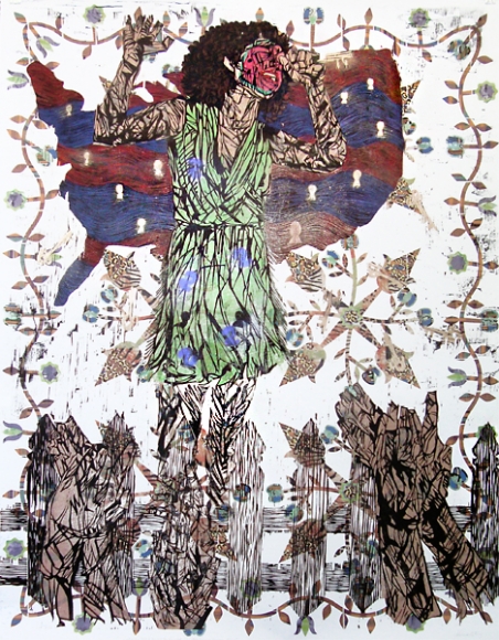
Today I went to Jonathan Ferrara. The front room (which is really the only room suitable for looking at large-scale works) was filled with large-scale woodcut reduction prints by Katrina Andry. The prints were dense with pattern, marks, color, and imagery. This visual texture was complex and engaging. The subject dealt with racial and gender politics but took time to decode. There was so much going on visually that they invited a long viewing with the layers of meaning slowly emerging from the work. Within the images there were quilt patterns (American, I would guess), and patterns of animal pelts (African, I think). There were also props: fruit, serpents, and some furniture featured in these tableaux. 

Courtesy of JONATHAN FERRARA GALLERY, New Orleans
My favorite piece depicts a woman singing, her hair curly, natural, a halo framing her face; her expression and posture are open and joyful. But imposed on her face is a watermelon slice, not easy to make out at first. In the far background is a quilt-like pattern, made up of flowers and spears, maybe. Behind the singer was an inverted map of the United States made of wavy bands of deep red and blue, dotted with white keyhole shapes that could also represent people. In the foregrown is a picket fence and in front of it (viewer -side) hands that appear to be clapping. This piece is loaded. I looked at it for a long time. Then I read the title, which was written at the bottom of the print: The Keys to the Gated Community and White Acceptance. Oh no, I said out loud.

I  read all of the titles: Genetic Inferiority: Darwin's Theory of White Superiority and Black Unintelligence, Congratulations You Made It!: Working Your Way Up the American Caste System, The Jungle Bunny Gave You Fever. The Only Cure is to Fuck the Bunny. She Wants It., and so on. Here is the problem I had with these titles: what the titles stated in words got across more powerfully in the work itself. The exclusion of the titles renders the work more broadly about race, gender and power, and maybe the artist wanted to be precise. I believe that any intelligent viewer would be able to deconstruct these images effectively and that any ambiguity would be an asset. Artwork, independent of written directive, allows the viewer to arrive at a unique kind of knowledge. Visual knowledge is not subject to the limits of language; this is the great potential of visual art. In this show the titles were a kind of reiteration like a comedian explaining the joke, like—I learned this one recently—a hat wearing a hat. The work itself was much smarter than the titles, which were merely clever. 

There are many ways that artists are currently expected to explain themselves and explain their work. Information is expected to accompany artwork. I think artists have internalized this precept and sometimes use the title line to give the work another little something, tell the viewer a little more, to over explain. Conversational titles (like "The Jungle Bunny Gave You...") can almost be categorized: wistful or cheeky. This is a trend I first remember noticing in the early 2000s. Once a trend is identifiable it ought to be reconsidered. Even writers have been instructed: show don't tell. Shouldn't artists be encouraged to do the same? 

All that said, the work in this show was serious, ambitious, and well worth seeing. So Julia Street worked out pretty well. I live here now, in New Orleans; David Zwirner does not. I’m okay with that. Mostly.